High-end skincare packaging design styles
Easy Health focuses on packaging design and production coordination, helping skincare brands translate style into executable packaging. This page breaks down key decisions for high‑end, minimalist and Korean‑style skincare packaging—from visual language to structural details—and how cartons, labels and primary packs align. Each project is assessed and confirmed by our account manager; contact us on WhatsApp for details.
Summary:Sharpen your skincare brand’s look with guidance on three styles—high-end skincare packaging design, minimalist, and Korean-inspired. The page maps colour, materials, finishes, and structures to retail/e-commerce contexts, helping ensure consistent presentation across Hong Kong and the Greater Bay Area.
How do I choose a skincare packaging design direction?
Yes. Start with channel and audience, then match each style’s typical choices: high‑end skincare packaging design favours low‑saturation palettes, dense boards and metallic accents; minimalist skincare packaging uses ample whitespace, one to two colours and matte finishes; Korean‑style skincare packaging leans into soft hues, rounded type and playful labelling. Next, align structure and barrier to product needs (e.g. light‑sensitive formulas) and validate durability and unboxing across e‑commerce, retail and KOL seeding. Our account manager will confirm the remaining details with you.
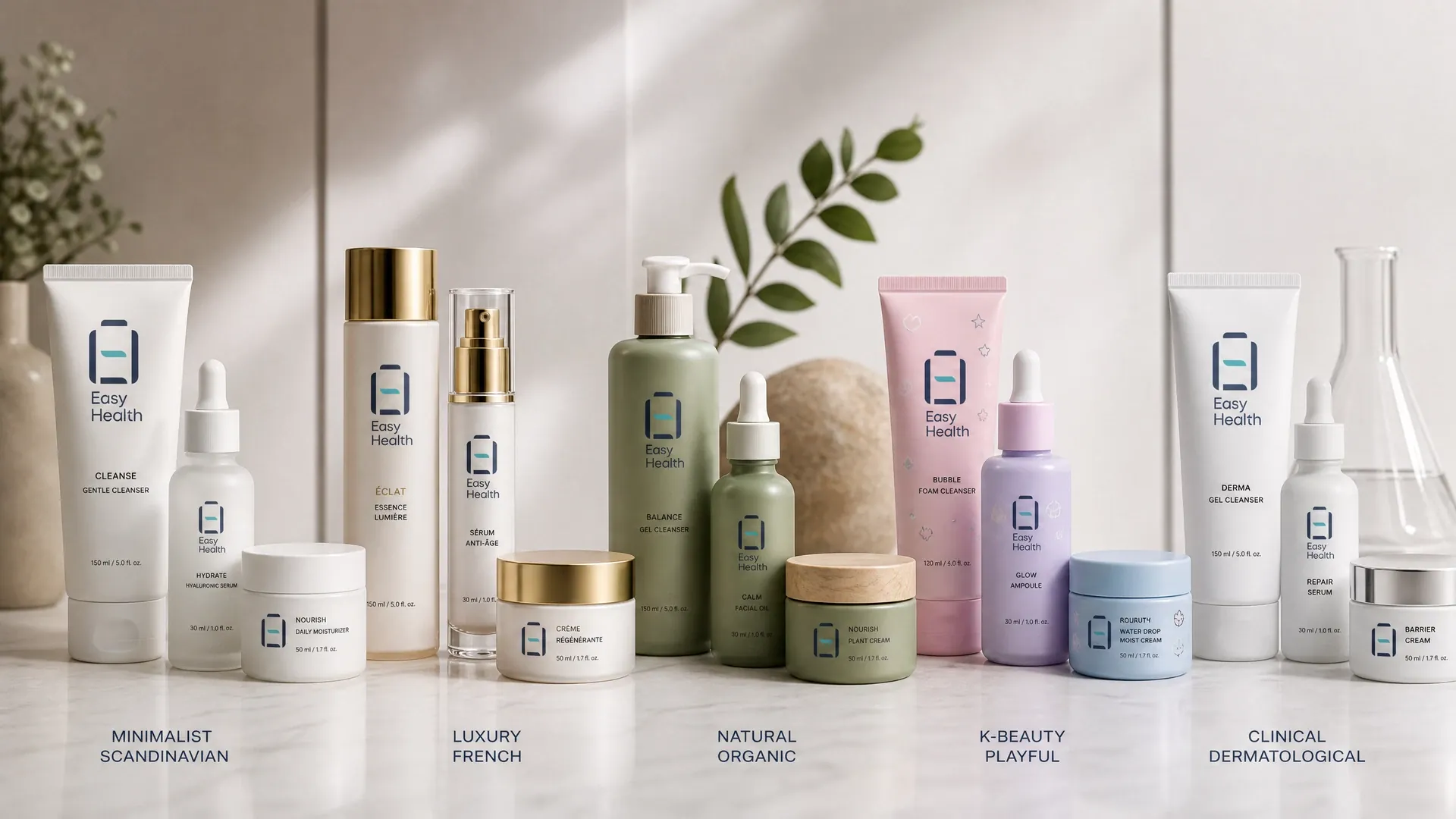
High-end skincare packaging design: tactility and depth
For premium or counter channels, the pack should communicate credibility and refinement. Use low‑saturation neutrals with restrained metallic or spot‑gloss accents to avoid fingerprinting and scuffing. Substrates often include heavy boards, wrapped rigid boxes, or thick‑walled glass; common structures are shoulder boxes, drawers or hinged magnet closures to pace the unboxing. Employ double‑layer labels or pull‑out inserts to house mandatory information while keeping a clean façade. On‑shelf, test brand legibility at one metre and batch colour consistency; for e‑commerce, verify abrasion resistance for foils and matte inks. Easy Health can coordinate cartons, inserts, labels and seals, with final assembly arranged at our Hong Kong facility.
- Low‑saturation palette with restrained metallic accents
- Heavy board/rigid box; shoulder/drawer/magnetic closures
- Double labels/pull‑outs to carry required info
- Check 1‑m shelf legibility and batch colour harmony
Minimalist skincare packaging: whitespace, proportion and durability
Minimalist skincare packaging relies on reduction, demanding precise proportion, whitespace and process control. Use one to two colours; ensure information hierarchy and readability across Chinese and English. Substrates include high‑whiteness boards or tactile papers, with matte lamination or soft‑touch varnish; pair bottles with solid‑colour sprays and subtle silkscreen. To protect large clean areas from scuffing during storage, add tear seals and individual dust bags, and test stack abrasion. For cross‑channel consistency, mirror the same grid and colour values on web/e‑commerce (supply colour specs and approve against samples). Easy Health coordinates print and material sourcing, and provides sampling to calibrate paper shade and matte density.
- One/two‑colour schemes with clear hierarchy
- High‑whiteness boards with matte/tactile coats
- Solid‑sprayed bottles with subtle silkscreen
- Dust bags and seals to mitigate scuffing
Visual guide: colour and finish pairings across styles
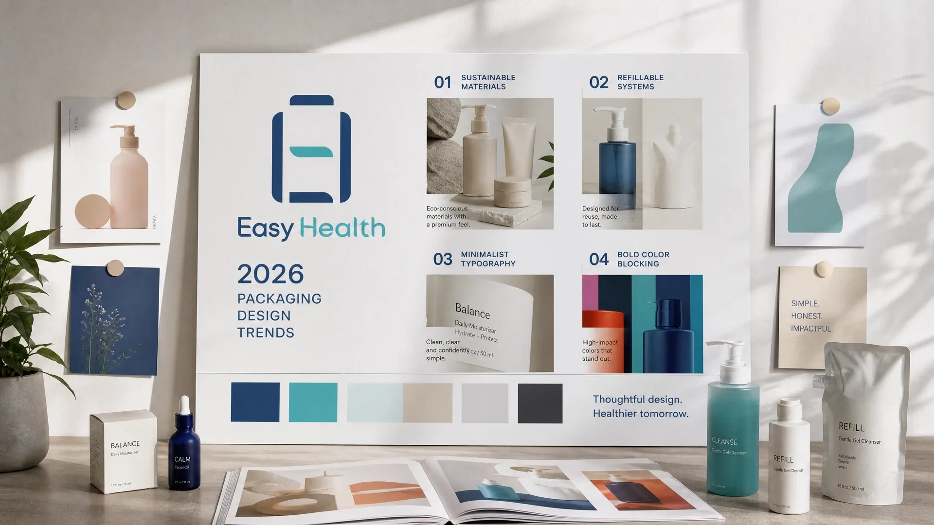
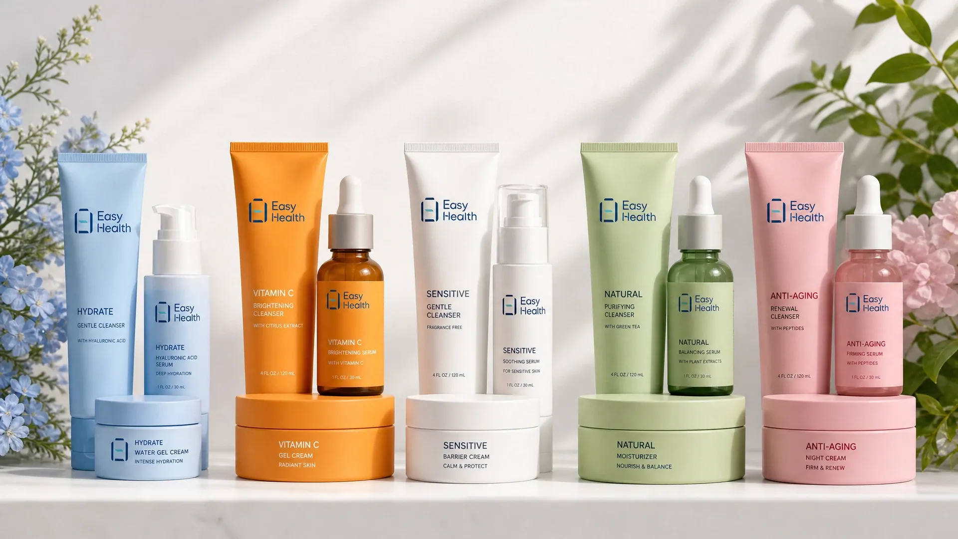
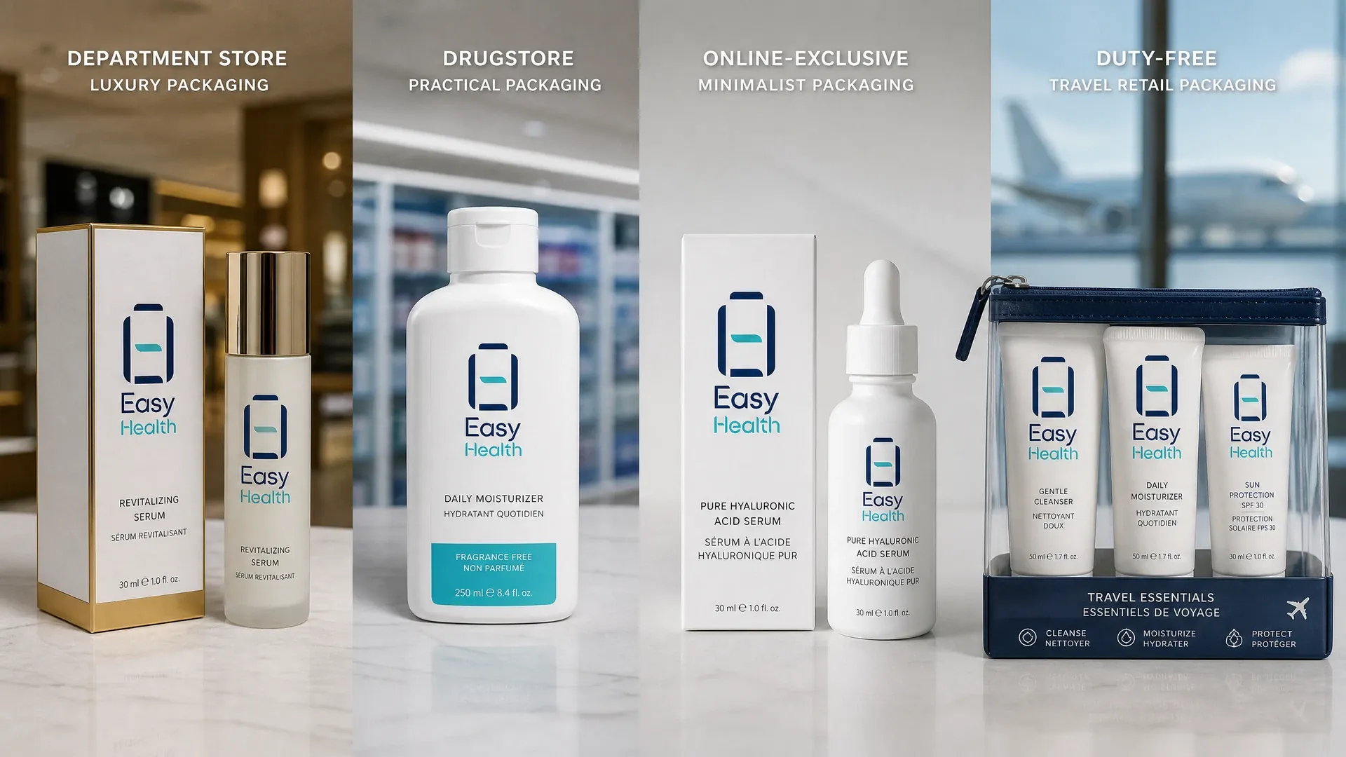
The image set illustrates typical combinations of colour, typography, substrates and finishes for each style, plus how they render in retail versus e‑commerce. Use it to shortlist two to three viable directions before sampling.
Korean-style skincare packaging: soft palettes and friendly tone
Korean‑style skincare packaging emphasises freshness, youth and approachability. Expect soft gradients, creamy hues and rounded typography; structures favour lightweight cartons or labelled tubes for e‑commerce and portability. Visuals may use line illustrations or geometric blocks, with semi‑transparent labels, windows or bevel cuts for depth. To manage frequent SKU refreshes, lock a master layout and swap colour blocks/icons; place barcodes and required info in side/back modules to keep the front light. Choose lighter boards or eco‑tactile stocks but test humidity and crush resistance for fulfilment. Easy Health coordinates labels, tube over‑labelling and cartons, and provides batch colour standards for approval.
- Soft gradients with rounded type for warmth
- Semi‑transparent labels/windows for depth
- Master layout; colour‑coded SKUs
- Lightweight stocks require humidity/crush tests
Omnichannel consistency: photography, unboxing and shelf logic
Style lives beyond the pack. For photography: high‑end prefers low‑contrast lighting with stone/metal props; minimalist uses high‑key light and tidy shadows; Korean‑style adds soft focus with pastel backgrounds. Unboxing flow: align shipper opening, standardise seal placement, secure inserts, present info card before product. On shelf, ensure legibility at one metre and order SKUs by size or function; in e‑commerce, keep consistent camera angle and whitespace. Easy Health coordinates cartons, labels and inserts, and supports sampling to validate unboxing and display.
- Define a fixed unboxing route and seal position
- Test hero legibility at 1 m
- Consistent angle/whitespace in listings
- Secure inserts to reduce in‑transit rattle
How we coordinate your packaging style direction
- Style and channel alignment:Define audience, retail/e‑commerce split, photography and unboxing needs; select high‑end/minimalist/Korean as the main route.
- Substrate and structure:Choose boards/bottle finishes, carton structure and labelling, balancing barrier, abrasion and logistics.
- Colour and finish sampling:Provide colour specs and swatches; sample to validate paper shade, matte density and metallic lustre.
- Information layout:Arrange bilingual text, barcodes and notices; keep the front clean and the side/back complete.
- Production and assembly:Coordinate printing and material supply; arrange finished assembly at our Hong Kong facility. Timelines vary by project and are confirmed by our account manager.
Inside the Easy Health Hong Kong Facility
Skincare packaging design style comparison
| Premium skincare packaging | Minimalist skincare packaging | Korean-style skincare packaging | Clinical-inspired skincare packaging |
|---|---|---|---|
| Matte deep blue glass | Pure white frosted bottle | Creamy pastel bottle | Clear lab-style vial |
| Metal debossed emblem | Whitespace-only layout | Hand-drawn floral illustration | Laboratory scale graphics |
| Centered serif lettering | Lightweight sans serif | Rounded K-beauty typeface | Monospaced technical font |
| Magnetic weighted cap | Slim straight cylinder | Rounded soft-touch shell | Knurled anti-slip cap |
| Velvet-lined insert tray | Single-layer slide sleeve | Color-block window box | Modular refill cartridge |
The above is a general reference; the final solution is assessed and confirmed by the account manager based on the project.
Pre-artwork and sampling checklist
- Lock primary style and define a 1‑m legible brand zone
- Provide colour values and font licences to avoid fallback issues
- Confirm info modules; minimal front, complete side/back
- Set abrasion and humidity tests for e‑commerce/fulfilment
- Sample‑check whiteness, matte level, metallic sheen and batch variation
- Standardise insert securing and seal position; script unboxing flow
Skincare packaging design style FAQs
What finishes are typical for high‑end skincare packaging?
Popular options include spot gloss, hot foil, deboss/emboss, matte lamination and soft‑touch varnish. Use restrained accents to reduce fingerprints and rub marks, and test for abrasion and colour transfer at sampling. If pairing with glass, specify shock‑absorbing inserts and tuned opening resistance for a refined unboxing.
How can minimalist packs avoid scuffing on large clean areas?
Specify matte or soft‑touch coatings with higher rub resistance; use individual dust bags and seals, plus dividers or polybags in shippers. Run stack and vibration tests for fulfilment. Ensure full ink cure and stable lamination, and set acceptance criteria during sampling.
How can brands manage colour across many SKUs in Korean-style packaging?
Create a master layout and a colour system (primary/secondary/warning). Distinguish SKUs via colour blocks and icons. Provide colour specs and control samples, run batch colour checks before print, and standardise barcode/regulatory modules to keep the front uncluttered.
What file formats should we supply?
Provide press‑ready editable files (AI/INDD) with linked 300‑ppi images, bleeds, dielines and spot/foil call‑outs. For bottle silkscreen, supply vector artwork with position guides. Include licensed fonts or outlines and a font list for verification.
What compliance points should cosmetic product labels consider?
Ensure clear product name, net content, usage notices and batch/expiry details, with space for bilingual layout. Requirements vary by market; consult local authorities or advisers. We can coordinate double‑layer labels or pull‑outs to house information while keeping the front clean.
Related Packaging Services
Discuss your skincare packaging design direction
Based in Hong Kong with our own local facility and GMP‑aligned production practices, Easy Health provides packaging design, labels and cartons, multiple pack formats (bottles, pouches, sticks, blisters), sampling and packaging production coordination. Each project is individually assessed and confirmed by our account manager. Message us on WhatsApp to discuss your product details and packaging needs.
Last updated: