Senior-friendly packaging design for supplement brands
This page focuses on practical details and testing methods for elderly-friendly packaging, with particular emphasis on ease-of-opening scenarios. From grip to tearing, blister push-through to one-handed use, we outline actionable design and testing points across structure, materials and on-pack information, with prototyping and small-batch trials coordinated at our Hong Kong facility, along with testing arrangements.
Summary:Focus on elderly-friendly packaging: easy-tear notches, larger caps with anti-slip knurling, balancing press-and-turn with ease-of-opening, blister push-through force, one-handed use, high contrast and larger type, tactile cues and anti-glare. Easy Health in Hong Kong coordinates design, prototyping and testing arrangements; certificate scope and document checks for GMP or FSSC 22000-related requirements can be arranged case by case with our account manager.
Can senior-friendly packaging design work with secure closures?
Yes—by finding a verifiable balance between barrier/seal integrity and ease of opening. Typical moves: larger caps with deeper knurling; tuned press-and-turn torque; wider easy-tear notches with optimised seal angles; defined push-through ranges for blisters; high-contrast cues and tactile markers for opening direction. We recommend physical prototypes and user tests with seniors and caregivers, then project confirmation and timelines with our account manager.
Why easy-open packaging for elderly users starts with grip and access
Ageing hands may have reduced strength, dexterity and contrast sensitivity. Design must address a continuous sequence: see—grip—open—dispense—reseal. Define usage: once daily or frequent access? One-handed? Caregiver-assisted? Then match structure and materials: larger-diameter caps with deep knurling; pouches with easy-tear notches and guided tear angles; blister push-through force or peelable lidding; sliders on zipper pouches. For graphics, use high contrast and larger type, avoid strong glare, and add tactile cues for opening direction. Validate each step with physical prototypes and live trials for fine tuning.
- Map usage frequency and one-handed needs
- Enlarge contact surfaces for secure grip
- Signpost opening direction and start point
- Balance resealability with seal integrity
Structures and materials: notches, caps, blisters and reclosability
Opening resistance varies widely by structure. Pouches benefit from wider easy-tear notches, guided tear lines and tuned seal widths to prevent jagged tears; stick packs need grip zones beside notches. Bottles may adopt larger diameters with deep knurling and a defined torque window when balancing press-and-turn with ease. For blisters, quantify push-through force; consider peelable lidding and larger finger support areas when needed. Zipper pouches can add sliders or pinch grips for one-handed use. Avoid overly hard or slippery exteriors and consider low-gloss films; inner barrier laminations should match product needs. Confirm choices via prototypes and measured tests.
- Pouches: wider notches and guided tears
- Sticks: non-slip grip zones near notches
- Bottles: larger caps with deep knurling
- Press-and-turn: define practical torque window
Visual guide: see key details at a glance
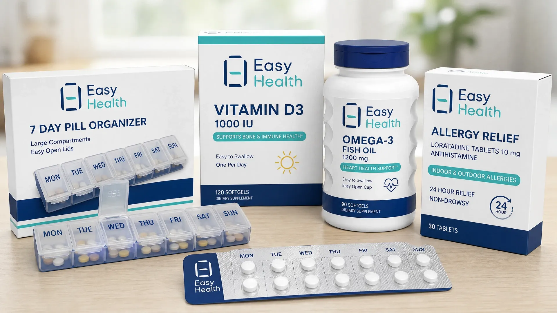
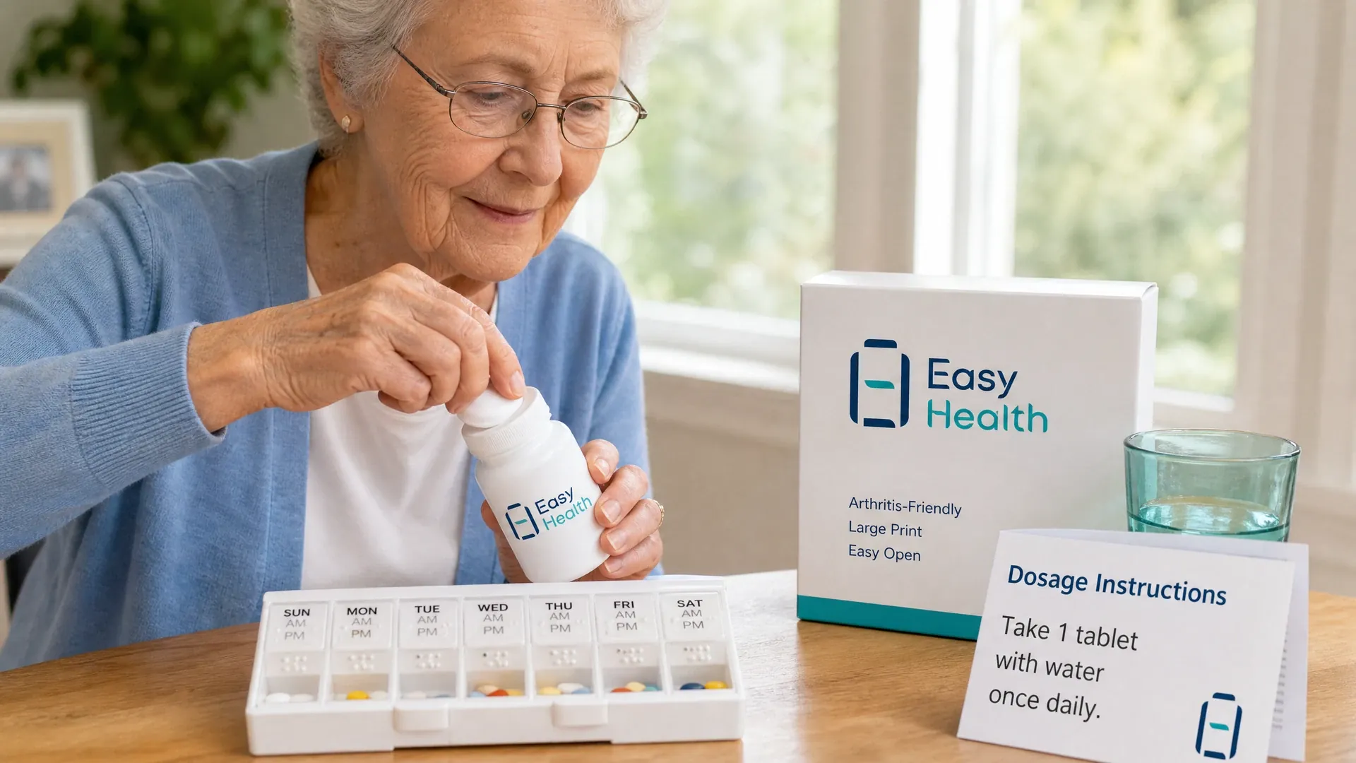
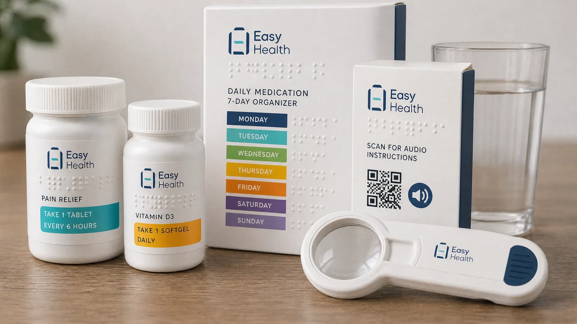
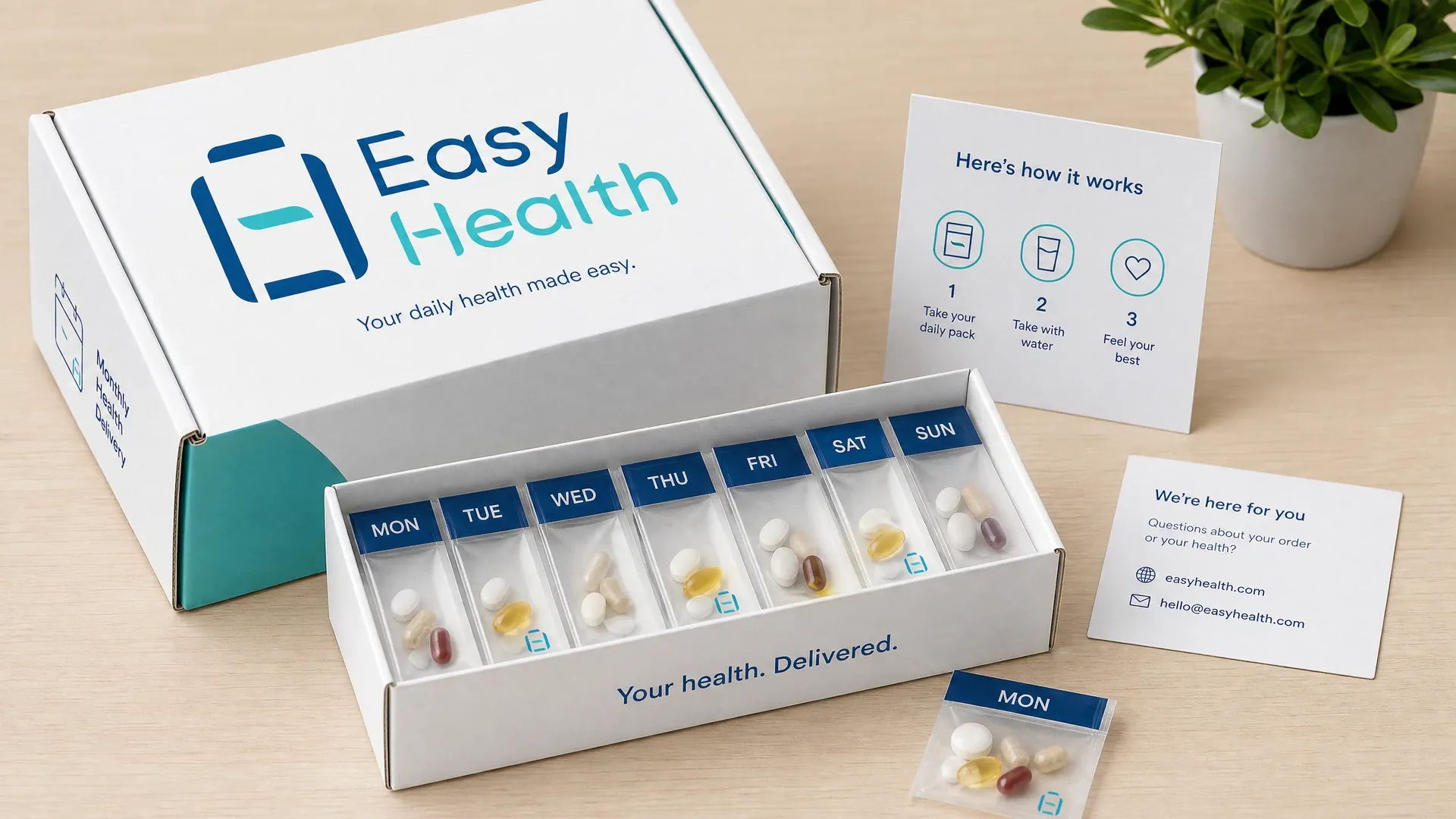
Illustrations show suggested placements and proportions for cap knurling and diameter, pouch notch geometry, blister push zones and high-contrast opening arrows—helping teams align quickly and prepare for prototyping.
Accessible supplement packaging: contrast, larger type and tactile cues
For seniors, legibility is as critical as openability. Use high-contrast colour pairs for the product name, directions and opening cues; increase type size, line spacing and white space as readers need; avoid large mirror-like metallics that reduce readability. Tactile features such as embossed dots or textures can mark the opening direction and first tear point. For prepackaged foods in Hong Kong, labels must meet Cap.132W and a “1+7” nutrition label is generally required; Mainland sales should be assessed separately against GB 7718/GB 28050. These are general points only — prepare the content, trial it on physical packs, and our account manager can help with the checks.
- Use high-contrast for key information
- Increase type size and spacing as needed
- Add tactile markers for opening cues
- Avoid strong glare that impairs reading
Hands-on validation: torque, push force and real scenarios
Elderly-friendly design needs tangible proof. Typical steps: define and measure cap-opening torque windows; record blister push-through forces by batch; test pouch tear stability with varied grips; attempt one-handed and wet-hand openings; invite seniors and caregivers to follow real-life routines while observing grip, gaze and dispensing. Track success rates and steps, then refine structure, materials or cues accordingly. Easy Health coordinates prototyping and small-batch packaging at our Hong Kong site and can arrange related testing steps; each project is individually evaluated and confirmed by our account manager.
- Quantify torque and push-force ranges
- Test one-handed and wet-hand scenarios
- Observe caregiver-assisted opening
- Record steps and success rates for tweaks
Workflow for design and physical trial arrangements
- Needs definition and scenario mapping:Confirm product form, access frequency, one-handed or caregiver use, and barrier/reseal needs; our account manager documents and plans the next steps.
- Structure and material proposal:Recommend ease-of-opening features—cap size/knurling, notch geometry, blister push or peel options, low-gloss exteriors—and define test metrics.
- Prototyping and quick tests:Coordinate prototypes at our Hong Kong site; arrange initial tests on tearing, torque and push force to correct weak points.
- User trials and observation:Arrange trials with seniors and caregivers; record success rates, steps and feedback to compile improvement actions.
- Graphics and label checks:Refine high-contrast, larger-type layouts and assist with checks against labelling points for the target market.
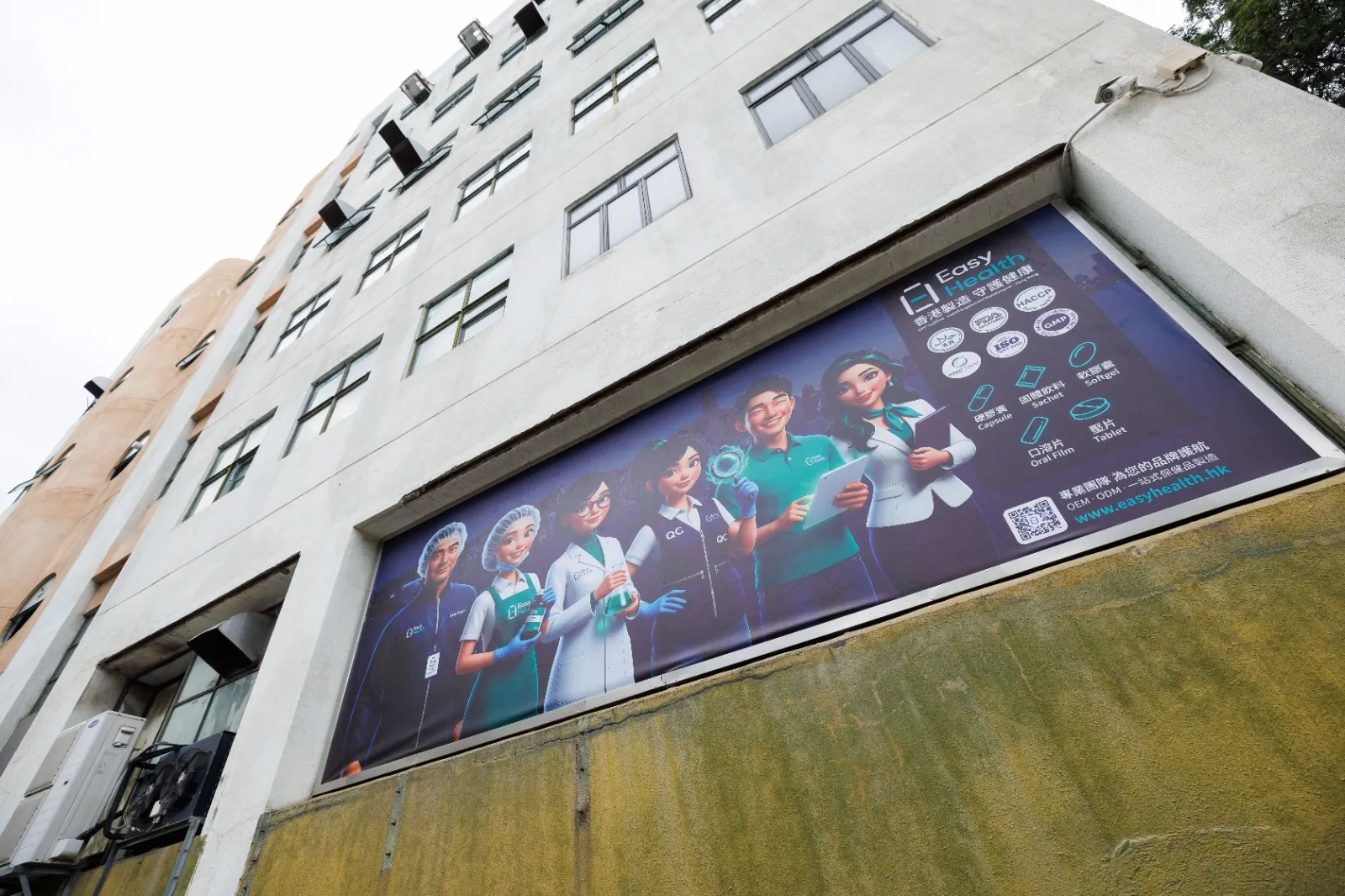
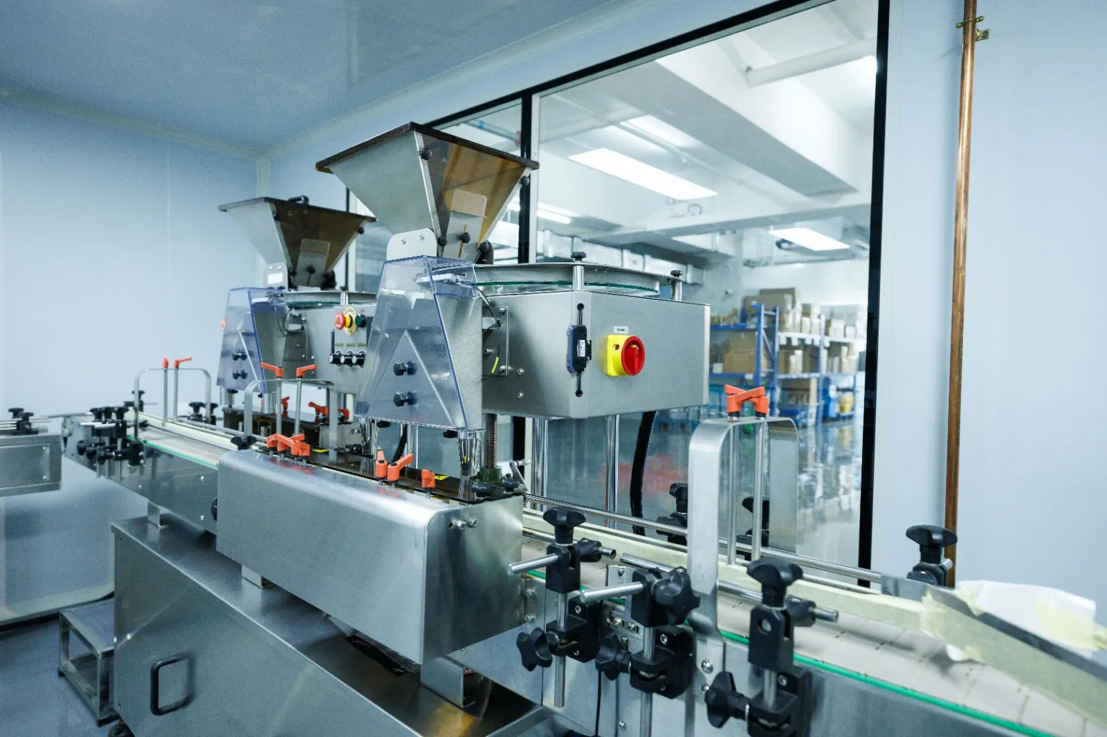
Inside the Easy Health Hong Kong Facility

Common opening mechanisms by use scenario
| Item | Twist-off cap | Pouch tear | Stick pack notch and grip |
|---|---|---|---|
| Suitable for | Powders/capsules/tablets | Powders/drinks | Instant powders/granules |
| Elderly focus | Large dia + deep knurl | Wider notch + guide | Non-slip grip area |
| Reseal | Inner seal/liner then reseal | Add zipper or tape | Usually non-resealable |
| Test metric | Opening torque | Tear stability | Tear initiation |
| Notes | Balance press-and-turn torque | Seal width affects tear path | Avoid slippery grip areas |
For blisters: set push force or use peelable lidding; for zipper pouches: consider sliders for one-handed use.
Design checklist for senior-friendly, easy-to-open packaging
- Is cap diameter and knurling depth sufficient for grip?
- Do pouch notches have guided tear lines and grip zones?
- Is blister push-through force within a repeatable target range?
- Is one-handed and wet-hand opening feasible and consistent?
- Is opening direction clearly marked with high contrast and tactile cues?
- Are glare-prone finishes avoided around key information?
Packaging design FAQs for senior users
How do I choose cap size and knurling?
Define grip scenario and one-handed use first, then prototype several diameters and knurl depths. Compare opening torque and fingertip contact area. Observe slippage at varied angles; increase cap height or add indentations if needed.
How should easy-tear notches be signposted?
Use a high-contrast arrow/icon, larger text prompt and a tactile cue. Leave unprinted grip zones on both sides. During prototyping, test identification and tearing under low light and with wet hands.
What if blister push-through is too difficult?
Adjust blister material thickness, forming depth, or move to a peelable lidding. Enlarge finger support areas. Measure push force across batches and observe fingertip placement to fine-tune.
How to keep high contrast without losing brand colours?
Create a functional contrast band for product name, directions and opening cues using black/white or deep/light pairs, while keeping brand colours elsewhere. Review mini-mocks under indoor and outdoor lighting before finalising.
Any labelling notes for Mainland China?
For prepackaged foods, GB 7718 and GB 28050 are commonly referenced for label content and nutrition facts, including language and units. Prepare content, test on physical layouts, then our account manager can assist with checks.
Related Packaging Services
Discuss senior-friendly packaging design and trial arrangements
Looking to improve ease-of-opening for seniors? Message Easy Health on WhatsApp with your product details and usage scenarios. We can coordinate prototyping, packaging production and testing arrangements at our Hong Kong site. Timelines depend on the project and will be confirmed by our account manager.
Last updated: