Packaging design trends for nutraceutical brands
At Easy Health, we see 2026 packaging design trends prioritising clarity you can read, tactility you can feel, and QR journeys you can trust. This page distils nutraceutical packaging design trends into actionable choices across materials, structures, labelling and compliance, informed by our Hong Kong plant OEM/ODM and packaging coordination experience.
Summary:A focused look at nutraceutical packaging design trends: clarity-first minimalism, natural tactility, sustainable choices, personalisation/limited runs, QR-enabled info, and unboxing-centric formats. Practical trade-offs help you choose by audience and channel.
Which packaging design trends matter in 2026?
Start with six: 1) Clarity-first minimalism—highlight product name, dosage and use; 2) Natural tactility—matte finishes, textured papers, wood-grain accents; 3) Sustainable choices—recyclable or recycled materials and separable structures; 4) Personalisation/limited editions—small-run variants and festive themes; 5) QR-enabled product info and traceability; 6) Unboxing experiences—structure and opening guidance. Calibrate each by audience, channel, and storage/transport needs.
Why trends matter more than a single style
Packaging design trends reflect evolving expectations: rapid comprehension, authentic materials, and QR-extended journeys. Since formulas, audiences and channels differ, combine only the elements that fit your case. From our Hong Kong OEM/ODM and packaging coordination, we see real trade-offs among layout clarity, barrier needs, shelf standout and regulatory markings. Define must-have info hierarchy, barrier/structure, and desired tactility/sustainability first; then plan labels, cartons, bottle/pouch/stick/blister formats and sampling to validate.
- Set info hierarchy first
- Prioritise barrier/materials
- Assume channel merchandising
- Then choose style and finishes
Trend 1: clarity-first minimalism
Clarity leads the current packaging design trends. For nutraceuticals, the front panel should prioritise product name, key actives or category, dosage/format and usage; secondary claims and imagery come later. Weight, whitespace and contrast trump ornament. In bilingual layouts, balance font sizes and line heights. Structurally, use front labels for essentials and back labels for details; for pouches, reserve clear areas for tear notch, best before/use by, and lot codes. Subtle matte or spot gloss can add depth without distraction.
- Three-step primary read
- Establish bilingual grid
- Front/back info layering
- Use restrained finishes
Visual examples: evolution, typography, finishes and shelf readability
The visuals illustrate design evolution, typography contrasts, material/finish details, and on-shelf readability scenarios. Use them for internal alignment and to benchmark distance and lighting during sampling.
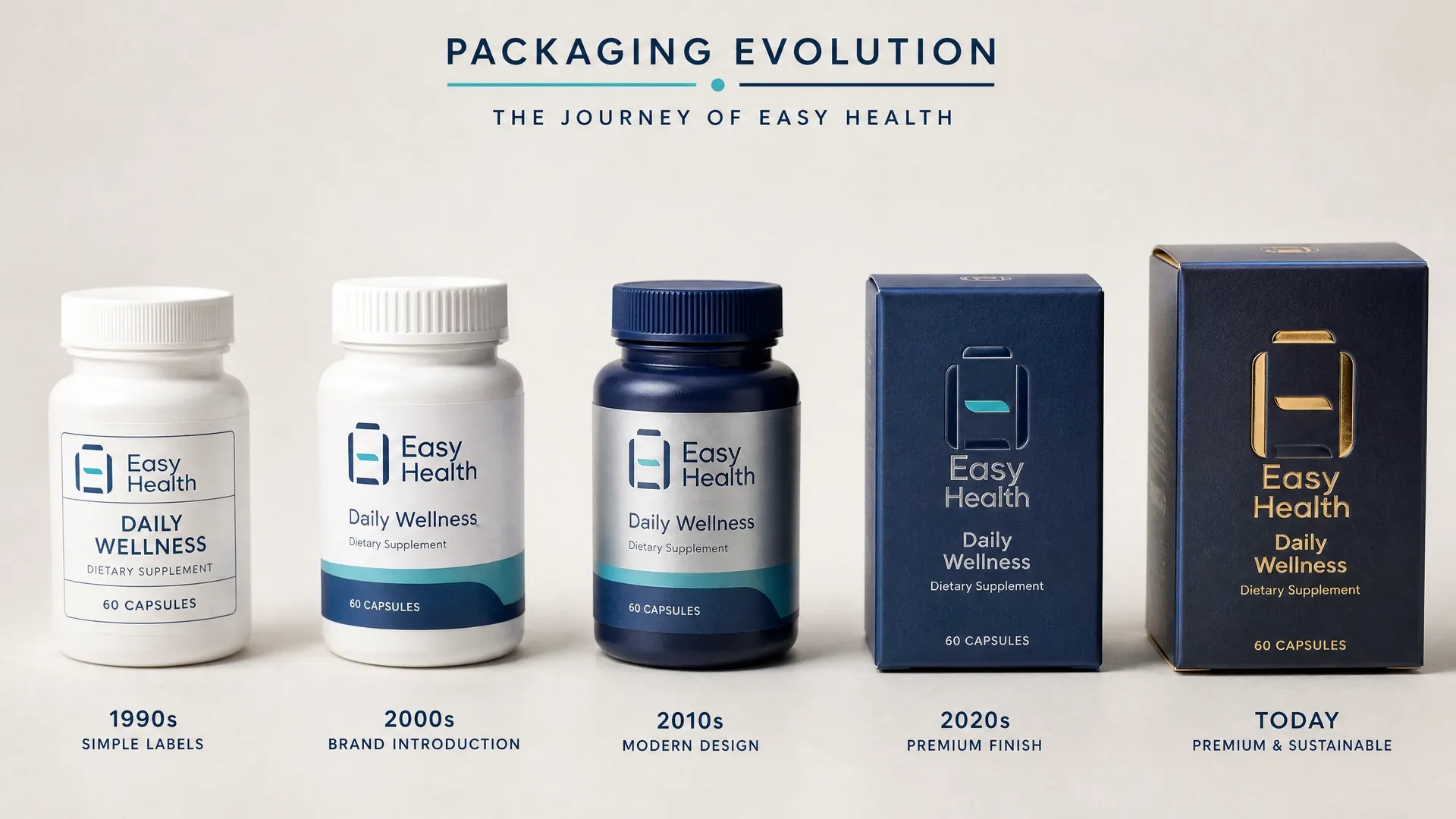
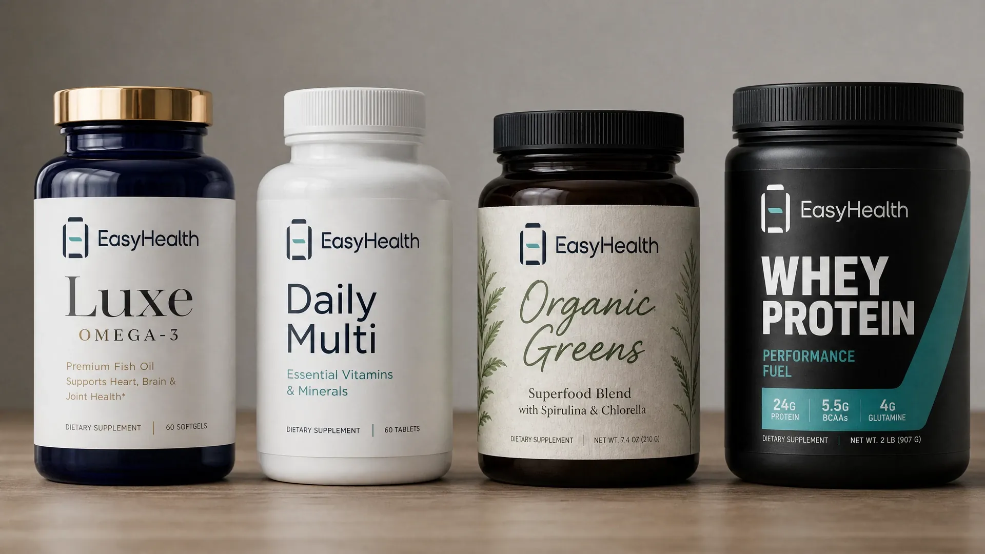
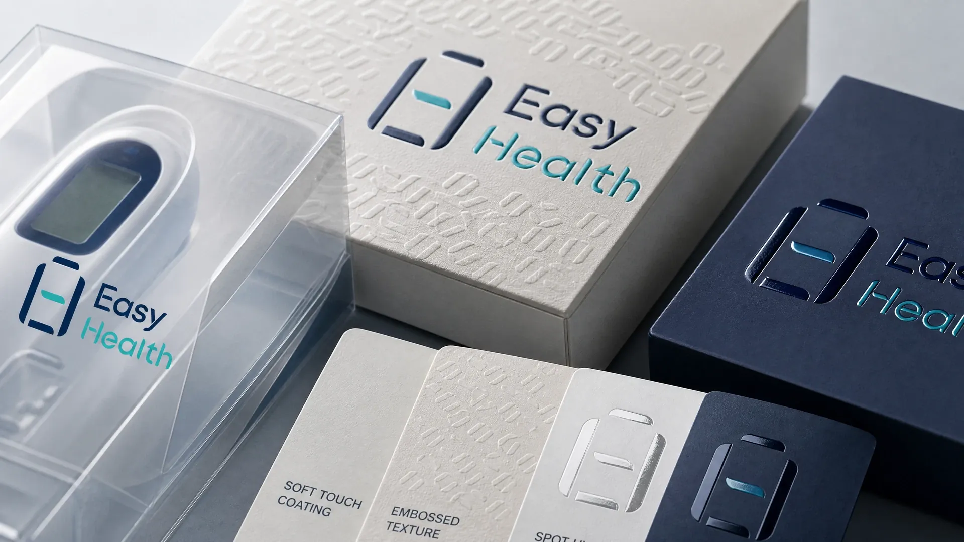
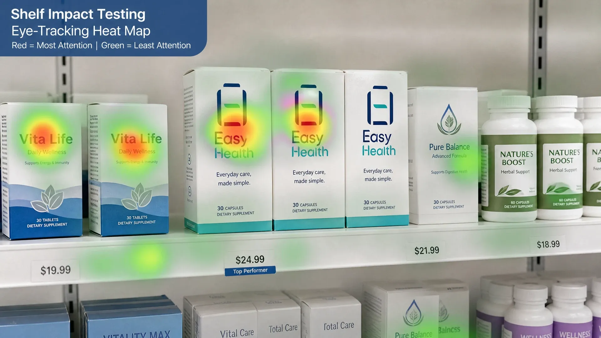
Trend 2: natural tactility and textured papers
Natural tactility signals authenticity. Uncoated or textured papers, restrained palettes and single-ink looks echo herbal, functional or vegan cues. Mind barrier and smudge resistance: where high barrier is needed, place the product in a functional bottle or inner pouch and wrap with a textured carton; or apply films on labels with tactile over-labelling. As textured papers scuff in transit, consider protective laminations or shipper inserts. During sampling, compare paper weights and emboss patterns under retail lighting and viewing distance.
- Tactility conveys authenticity
- Split barrier via inner/outer
- Add scuff protection
- Sample under retail lighting
Trend 3: clear recycling and material information
Shoppers want to know what to do next. Make recyclability/recycled content and disassembly steps easy to read, with simple icons or a QR explainer. Consider mono-material structures, removable labels, or recycled paper cartons. Balance barrier and shelf-life: use functional contact layers and recyclable outers. As recycling systems vary by market, keep guidance general and provide a QR for details. Contact us on WhatsApp and our account manager will assess options per project.
- Favour mono-material builds
- Show clear disassembly steps
- Balance barrier and shelf-life
- Extend guidance via QR
How can brands apply trends to material and structure decisions?
- Brief and trend alignment:Anchor info needs and style by audience, channel and regulatory frame.
- Material and structure advice:Assess bottle/pouch/stick/blister plus carton/label combos and barriers.
- Sampling and visual proof:Arrange samples; proof spacing, contrast and tactility under real lighting.
- Label and regulatory checks:Support wording/language checks and date mark placement for markets.
- Packaging production coordination:Coordinate print/material supply and complete packing in GMP conditions.
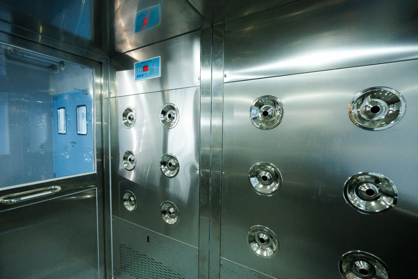
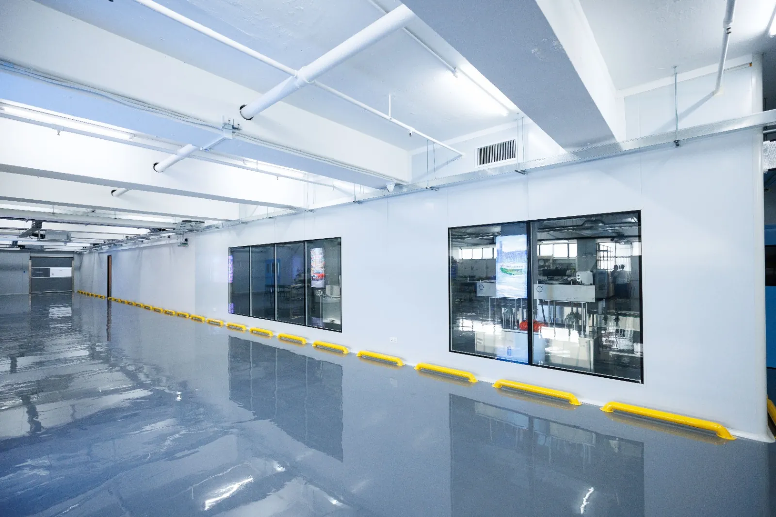
Inside the Easy Health Hong Kong Facility

2026 comparison of nutraceutical packaging design trends
| Comparison Item | 2026 Trend Focus | Sustainable Materials | Info and Interaction |
|---|---|---|---|
| Clinical clean | High-contrast whitespace | Mono-material pack | Large-print labeling |
| Tech smart | Dynamic linear visuals | Recyclable metallic film | NFC smart tag |
| Nature green | Plant-dyed soft palette | Bio-based tube resin | Simple recycling icons |
| Premium minimal | Monochrome rational layout | Matte recycled paper | Focus on key selling points |
| Local heritage | Herbal pattern redesign | Bamboo fiber paper | Traceable QR code |
This is general guidance only; the final solution is assessed and confirmed by the account manager for each project.
Trend-to-pack checklist
- Primary read in three steps (name, dose, usage)
- Bilingual grid fixed; font sizes and contrast tested
- Barrier and shelf-life mapped to structural layers
- Recycling/disassembly guidance clear with QR for details
- Space reserved for lot code and date marks (best before/use by)
- Readability checked at target lighting and distance during sampling
Packaging design trends FAQs
How can we keep visual consistency across personalised or limited runs?
Lock the information grid and type choices, then vary only hero imagery or colour accents. With variable digital print, keep logo and primary info constant while changing illustration, pattern or colour bands. During sampling, compare 3–5 variants at the same shelf distance to confirm legibility and range recognition.
What should our QR codes link to?
Good options: ingredient sourcing and batch traceability, usage videos, FAQs, language switch pages, and recycling/disassembly guidance. Ensure short URL stability, mobile-friendly pages, and a protected scannable area on the label or carton.
Will textured papers affect storage and transport?
Textured stocks scuff and soil more easily. Consider protective coatings or scuff-resistant grades, and optimise shipper inserts to reduce friction. For long routes or high humidity, use a functional inner pack with a tactile outer carton.
How do we build regulatory requirements into early design?
Fix your target markets and frameworks first: Hong Kong prepackaged foods follow Cap.132W and the “1+7” nutrition scheme; Mainland prepackaged foods often reference GB 7718 and GB 28050. For bilingual packs, product name and ingredients should appear in both languages. Reserve space for nutrition, allergens, date and lot codes; we can help review wording and placement.
How can high-barrier packaging balance material choices?
Use a split approach: functional contact layers for stability and recyclable outer structures with clear disassembly steps. Evaluate recycled content levels and local system feasibility. Our account manager will confirm options per project.
Related Packaging Services
Discuss your packaging design brief with Easy Health
Easy Health operates in Hong Kong with our own plant, where packaging and production are coordinated. We offer nutraceutical OEM/ODM, packaging design, labels and cartons, bottle/pouch/stick/blister options, sampling and packaging coordination. Ready to land these design trends? Message our account manager on WhatsApp to discuss your product and packaging needs. Timelines vary by project.
Last updated: