Supplement packaging layout design
Supplement packaging layout is not only about aesthetics but also legibility and compliance. From bottle labels to cartons, sachets and blisters, Easy Health leverages production know-how from our Hong Kong facility to integrate dielines, materials, finishes and regulatory content into layout decisions. Your account manager assesses each project and coordinates mock-ups and production.
Summary:Focused on supplement packaging layout: hierarchy, legibility, dielines and bleed—balanced with regulatory clarity and production realities. Easy Health coordinates design mock-up and packaging production in Hong Kong, optimising labels and cartons for your product form and channel, reducing rework risks and easing approvals.
What layout details should be confirmed first?
Define: 1) pack format and fill (affects print area and curvature), 2) material and finishes (varnish/lamination/foil affect contrast and barcode), 3) dieline structure and glue/overlap zones, 4) order of regulatory fields (ingredients, nutrition, warnings, net content, origin), 5) languages and minimum type sizes, 6) colour and print method (CMYK/spot), 7) barcode/trace code placement, 8) mock-up and checkpoints. This foundation reduces rework in supplement packaging layout.
How should hierarchy and type sizes guide supplement packaging layout?
On shelf and in thumbnail views, your hierarchy must serve quick recognition and regulatory clarity. Start with brand/product name and form/category, then key benefits/dosage, followed by mandatory information. For bilingual layouts, avoid tight line-by-line alignment; use modular blocks and a consistent baseline grid. For curved labels, check optical distortion and overlap zones so key visuals do not cross seams; for cartons, prioritise the main facing panel and consolidate ingredients and directions on side panels. Reserve barcode quiet zones and avoid placing codes over foils or heavy textures. Test with greyscale wireframes to validate information density, then lock type sizes and leading, keeping body text readable for older users.
- Three layers: name → claims/category → regulatory
- Avoid seams and curvature for key visuals
- Reserve barcode quiet zones; avoid over special finishes
- Prototype in greyscale to validate density
Dielines and bleed: turning design into a manufacturable layout
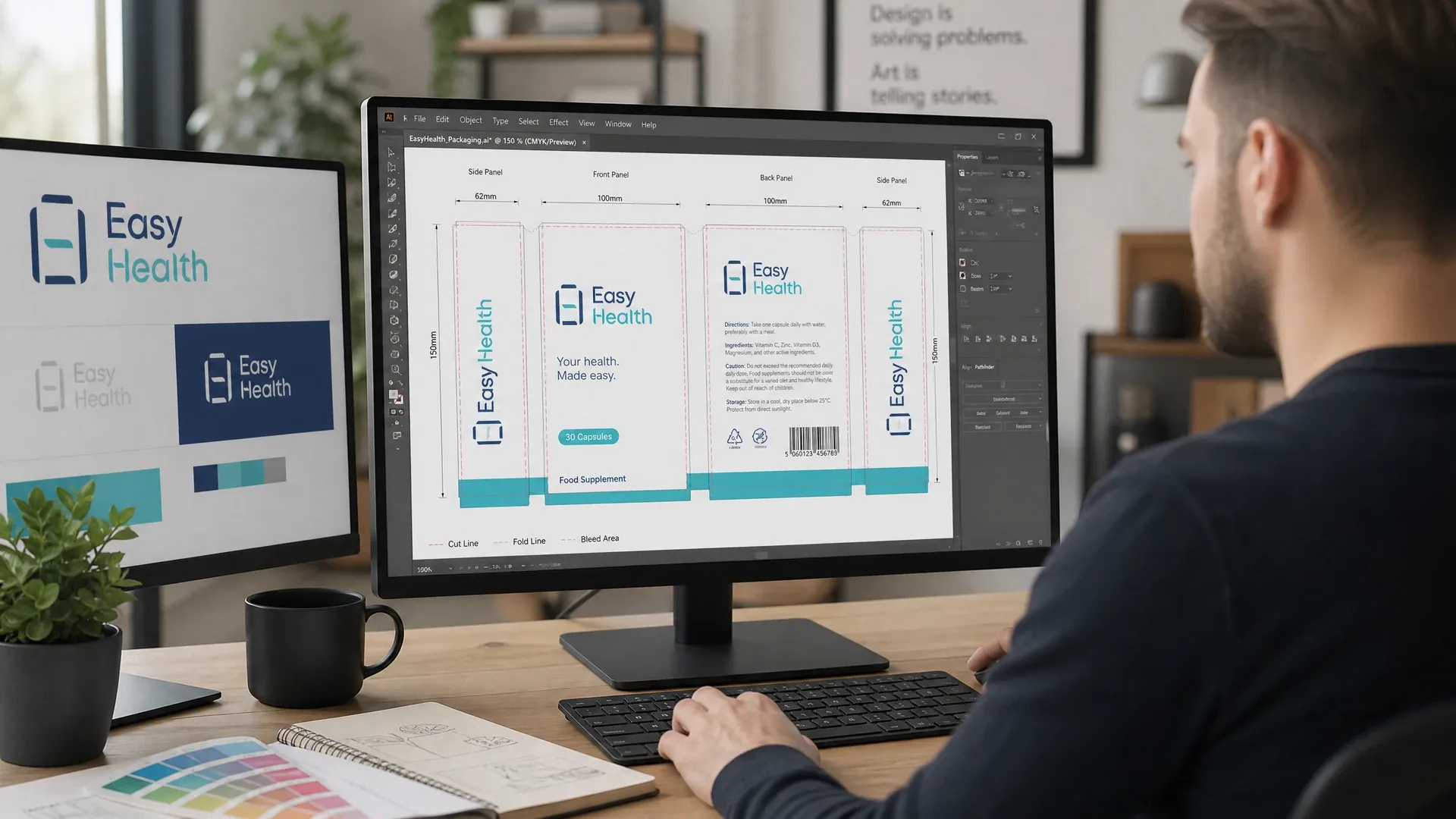
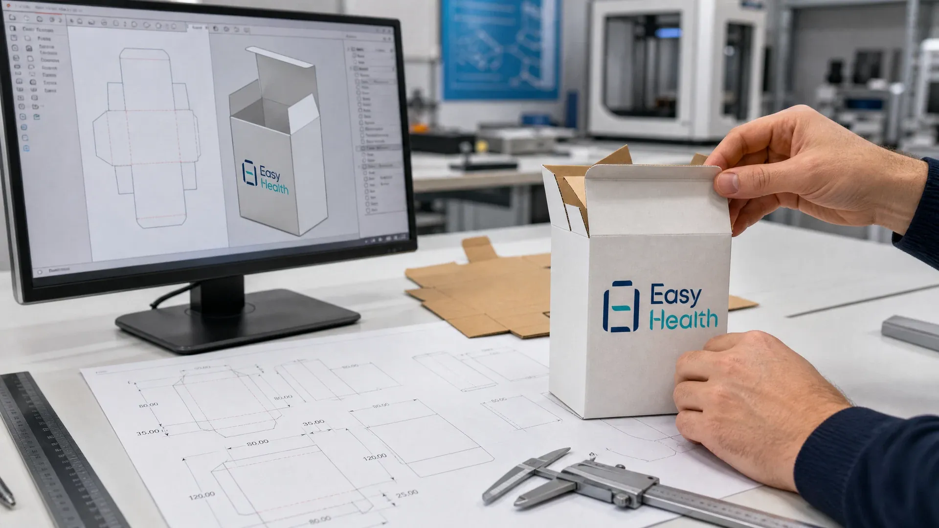
The dieline is the skeleton of your layout. Typical practice: set 2–3 mm bleed and keep critical text/logos 2–3 mm inside the trim; mark folds, windows, hang holes, tear notches and glue areas on separate layers. Curved labels require arc compensation matched to diameter and application; sachets and sticks must reserve heat-seal margins and lot-code areas; blister cards need hook positions and load considerations. Preflight should verify 300 ppi raster images, embedded/outlined fonts, CMYK/spot setup, and separate plates for coatings or foils. Easy Health can coordinate dieline templates, mock-ups and packaging production, with details and timing confirmed by your account manager.
- Annotate bleed and safety on layers
- Lock heat-seal and lot-code areas early
- Use separate plates for special finishes
- Preflight: resolution/fonts/colour
Visual guide: from dielines to review meetings
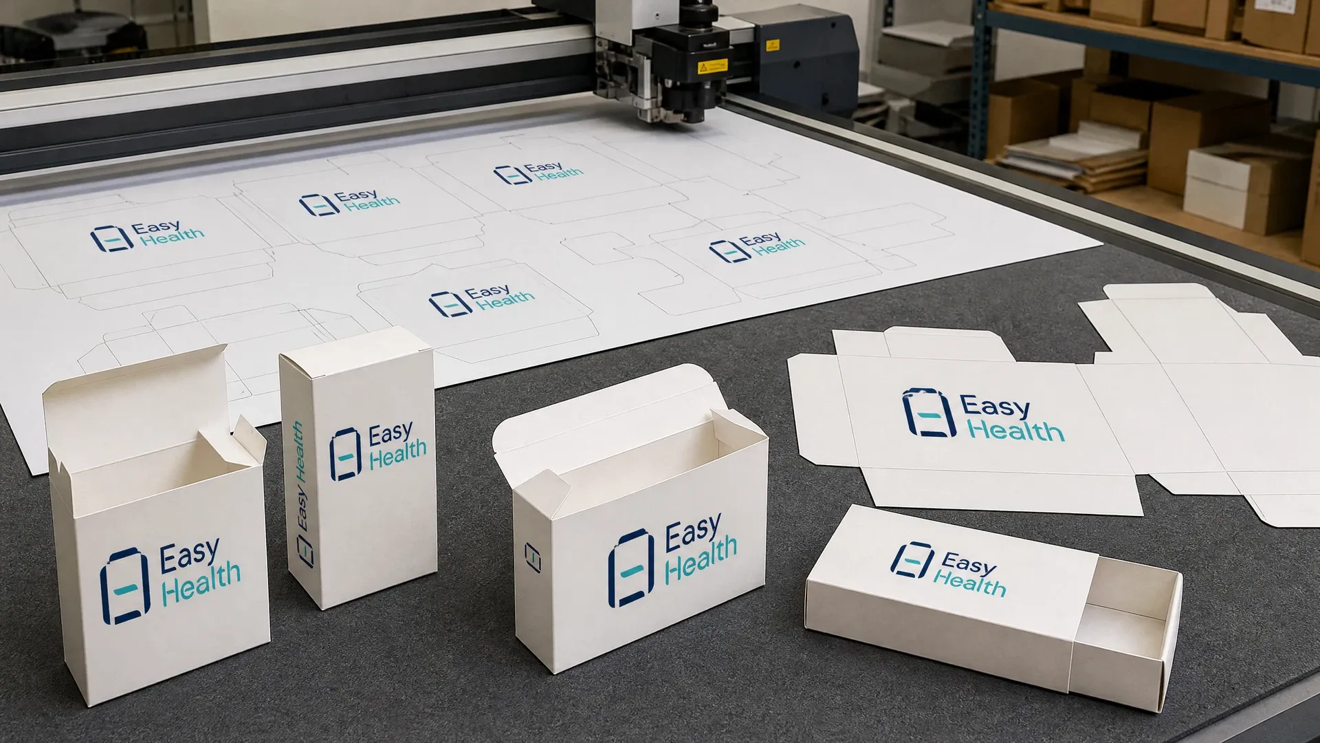
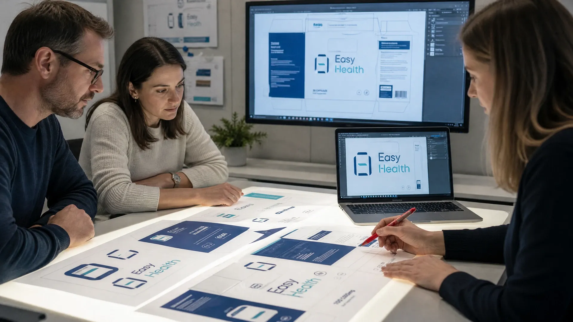
See how layouts are executed in practice: structural development and dieline templates, curved label expansion with overlap zones, carton folds and cut-outs, and review sessions checking type sizes, barcodes and finish plates one by one.
Regulatory fields and content order before aesthetics
For Hong Kong, common requirements include listing ingredients, net quantity, origin and allergen statements under Cap. 132W, and using the “1+7” nutrition labelling format. Products involving Chinese medicines should consider Cap. 549. For Mainland China, follow GB 7718 and GB 28050. For multi-market packs, use modular blocks to separate jurisdiction-specific text. Place warnings and directions where users naturally look. Avoid medical or therapeutic claims. Easy Health can coordinate content lists and placement; final compliance rests with the brand owner.
- Prioritise mandatory fields and warnings
- Use modular blocks for multi-market text
- Avoid medical/therapeutic claims
- Brand owner validates final legal text
Materials and finishes: contrast, scuff resistance and code readability
Coated and kraft boards, synthetic papers, PVC/PP labels and foil laminates differ in gloss and ink absorption. Matt films improve comfort but lower contrast; gloss and metallic finishes attract attention but may hinder barcode scans; dark backgrounds need heavier weights and wider leading. For cold or humid chains, use moisture-resistant adhesives and inks; for scuff-prone logistics, consider spot UV or abrasion-resistant coatings. Reserve a high-contrast area without special finishes for serialisation or QR. Always proof under real lighting: check 1-metre legibility, instant QR scan, and batch-to-batch colour consistency. Easy Health coordinates printing and material supply according to the chosen substrate.
- Matt reduces glare but lowers contrast
- Keep codes away from glossy/metallic effects
- Use moisture-resistant inks/adhesives when needed
- Prototype under actual retail lighting
How we coordinate production-ready layout files
- Brief and content list:Your account manager gathers product, channel and regulatory scope, defines languages and mandatory fields, and locks the key parameters.
- Dieline and specs:Create or coordinate dielines, annotate bleed/safe zones and finish areas, and confirm barcode, lot-code and seal locations.
- Wireframe and hierarchy:Use greyscale wireframes to organise hierarchy and fields, review type sizes and bilingual flow, then move to colour.
- Mock-up and field tests:Arrange mock-ups and test under real lighting and substrates for legibility and scanning, then fine-tune.
- Preflight and handover:Run checks on resolution, fonts, colour and finish plates, output production files and coordinate with suppliers.
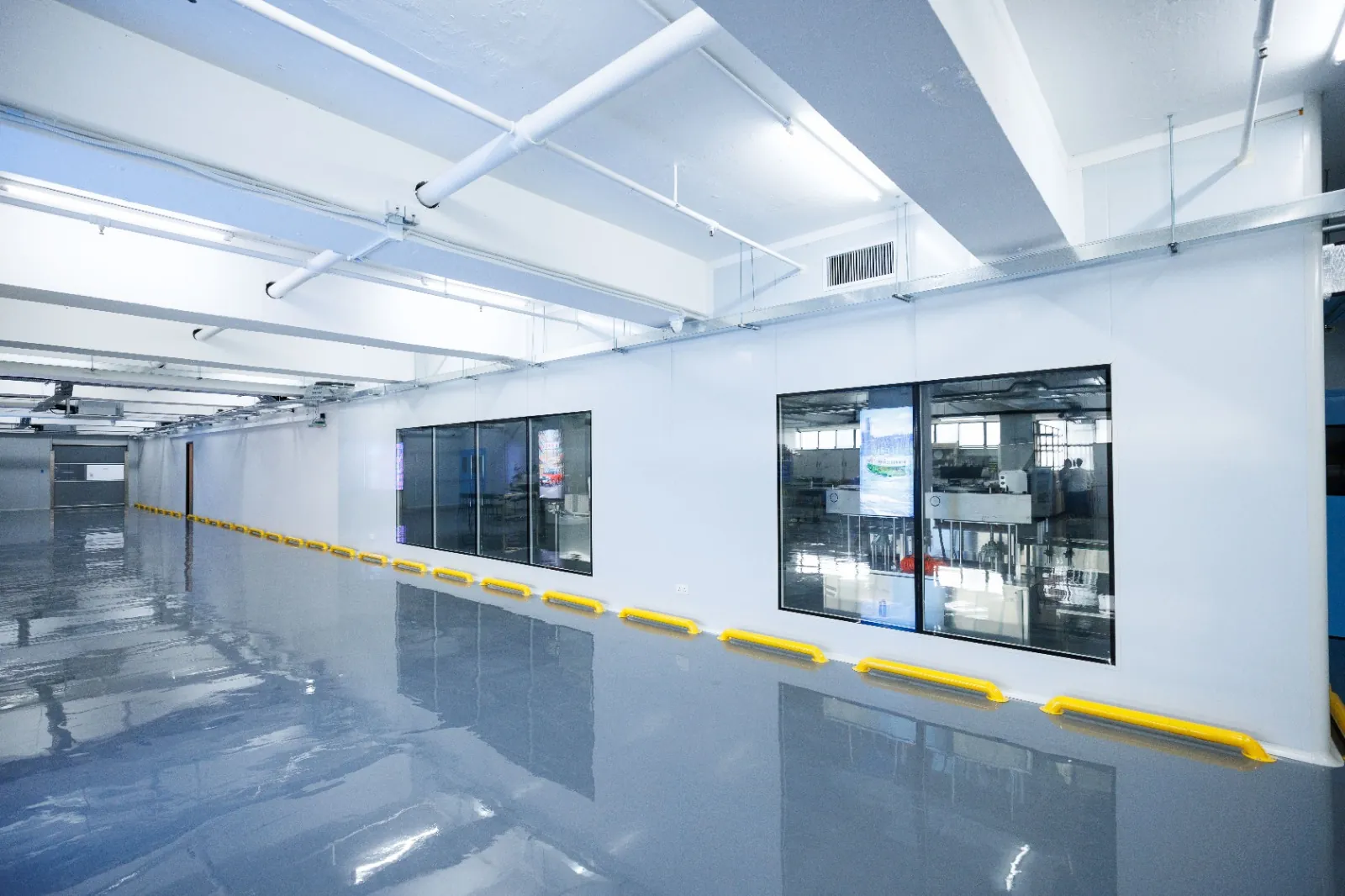
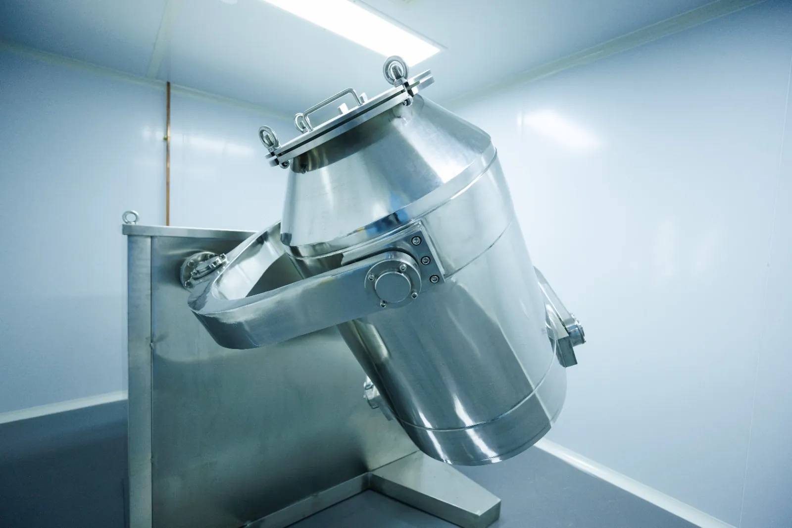
Inside the Easy Health Hong Kong Facility

Common supplement packaging layout formats and notes
| Format | Suitable for | Layout challenges | Key notes |
|---|---|---|---|
| Wrap-around bottle label | Capsules, tablets, drops | Curvature and seam overlap | Keep off seam; larger type; reserve serial area |
| Folding carton (single) | Outer boxes, single units | Front-facing priority; dense side info | Clean front; detailed sides |
| Blister card | Single-dose items | Hook position and load | Whitespace above hang hole; high-contrast barcode |
| Laminated pouch | Powders, solids | Heat-seal and tear notch | Reserve seal; keep finishes off codes |
| Stick pack | Oral powders | Narrow-width information | Vertical hierarchy; concise bilinguals |
Scenarios vary; assess each project against product, channel and regulatory scope.
Quick checks before finalising your layout
- Have you listed all mandatory fields and languages with priorities?
- Are dieline, bleed and safe areas set, with overlaps and glue zones marked?
- Are barcode and lot-code areas fixed with adequate quiet zones and contrast?
- Do materials and finishes match channel and storage/transport conditions?
- Are type sizes, leading and colour contrast validated in real tests?
- Do you have a mock-up and review checklist scheduled?
Supplement packaging layout FAQs
How should I balance Chinese and English type sizes?
Define hierarchy first, then test with a scale mock-up. Keep Chinese body text comfortably readable; for English, slightly increase leading to offset thinner glyphs. For multiple languages, split regulatory content into modules rather than crowding one panel.
Where should barcodes and QR codes be placed?
Use a flat, high-contrast area without special finishes, with quiet zones around. Avoid seams on curved labels and glossy/foiled/textured areas on pouches or cartons. Test with multiple scanners before production.
Can Easy Health coordinate dieline templates and bleed guidelines?
Yes. We can coordinate dieline templates with technical annotations (bleed, safe zones, folds, finish areas) and run preflight checks before mock-ups. Formats and timelines are confirmed by your account manager.
How can colour shifts be managed from mock-up to production?
Standardise colour settings (CMYK or spot), supply swatches or press samples, and confirm substrate before the final proof. Review under retail lighting and define acceptable tolerances. Keep reference retains for batch start-ups.
Who is responsible for final approval of legal text on the layout?
We coordinate field organisation and flag known regulatory points, but final wording and compliance must be approved by the brand owner or its advisors. For multiple markets, verify with local authorities or consultants.
Related Packaging Services
Discuss your supplement packaging layout
Need label, carton, pouch or blister layouts and mock-ups? Message Easy Health via WhatsApp with your product details, markets and timeline. We will assess the project and coordinate dielines, labels and packaging production in Hong Kong.
Last updated: