Supplement Brand Identity Design for Packaging
This page focuses on brand identity design for supplements: defining architecture, colours, typography, imagery and codes, then deploying them across diverse packaging formats and channels. In Hong Kong, Easy Health coordinates label and carton design, sampling and packaging production handover to keep bottles, pouches, sticks and blisters consistent while addressing food labelling and legibility.
Summary:Supplement brand identity that bridges strategy and shelf-ready packaging. Leveraging a Hong Kong GMP environment and FSSC 22000 system, we align labels, cartons, bottles, sachets, sticks, and blisters while balancing compliance, print, and supply. A client manager safeguards coherent brand-line experiences.
Who Is Health Supplement Branding Design For?
Ideal for supplement brands building or refreshing a visual system, portfolios needing clear tiering and colour navigation, launches across bottles/pouches/sticks/blisters, and teams serving both Hong Kong and Greater Bay Area. We review your assets (logo, sub-brands, font licences, imagery), formulas and labelling needs, propose brand architecture and key codes, then deploy them into printable labels and cartons with sampling and production handover. Timelines vary by project and are confirmed by a client manager.
Supplement Brand Identity Design from Strategy to Shelf
Effective brand identity for supplements is more than aesthetics; it must be replicable and compliant. We clarify brand architecture (master, sub, endorsed), naming and SKU navigation; build colour and type hierarchies, graphic vocabulary and asset libraries; and define layout zones (brand, product info, mandatory panel) so all pack sizes remain orderly. For bottles, pouches, sticks, blisters and cartons, we specify identity elements that survive material changes—colour references mapped to inks/digital profiles, proportional blocks, scalable type and minimum legibility. Designs are based on real print and regulatory font sizes to avoid late-stage rework. We deliver brand guidelines and print-ready files and coordinate sampling to validate consistency under real materials and lighting.
- Architecture first: SKU navigation and naming
- Cross-material colour and type system
- Reserve mandatory panel to prevent rework
- Sample to verify ink–material behaviour
Supplement Packaging Brand Design Across Formats
A single brand may use bottles, foil pouches, sticks, blisters and cartons. To balance unity and clarity, we apply a ‘core identity + governed variables’ model: core identity fixes logo position, key colour, headline type and hero graphics; variables encode function category colours, icons, SKU codes and flavour/dosage form tags. For varying shapes, we provide responsive templates (wrap labels, side labels, front/back pairs, leaflet integration) and a surface-finish menu (matte/gloss films, metallic inks, spot varnish) with notes on food-contact and legibility. This achieves clear shelf and e-commerce navigation while enabling fast replication in production.
- Fix core identity; reuse category rules
- Responsive to wrap/side/front-back labels
- Show flavour and dosage to reduce mispick
- Document finishes and constraints
Visual Walkthrough: From Identity to Full-Line Consistency
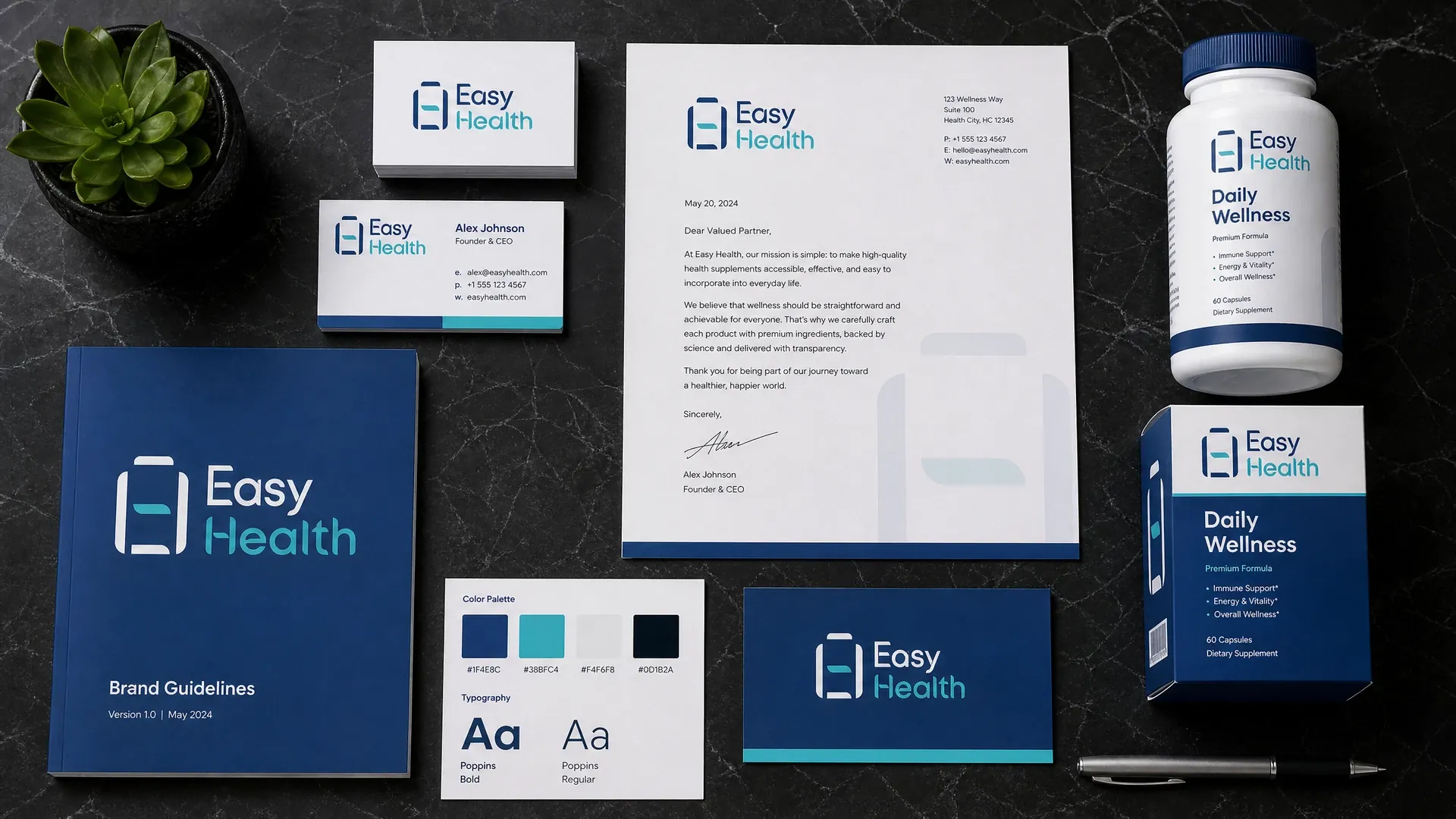
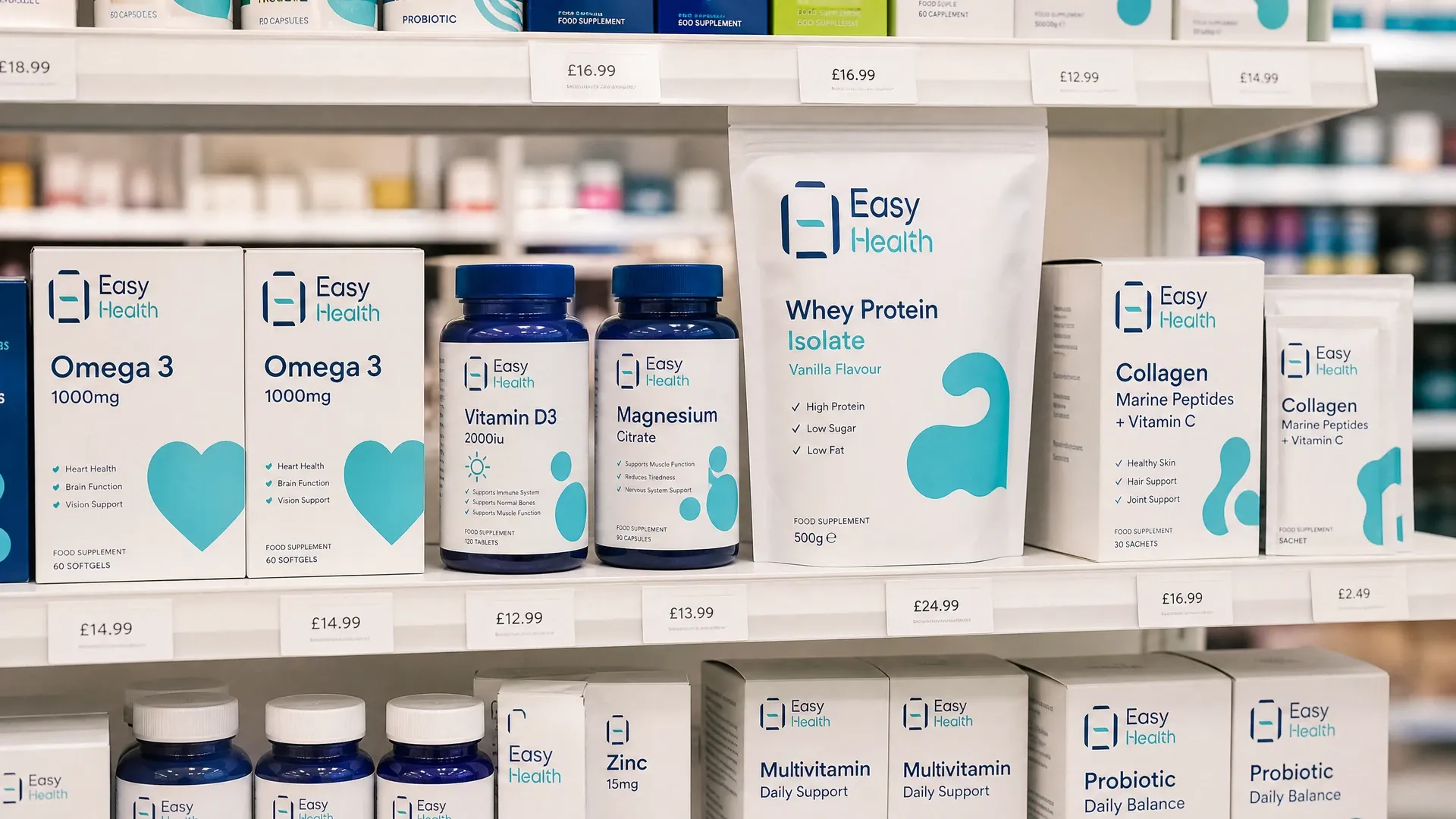
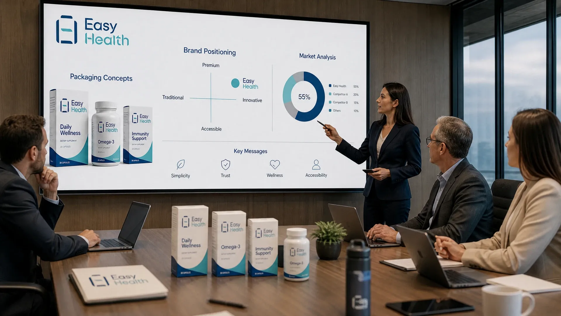
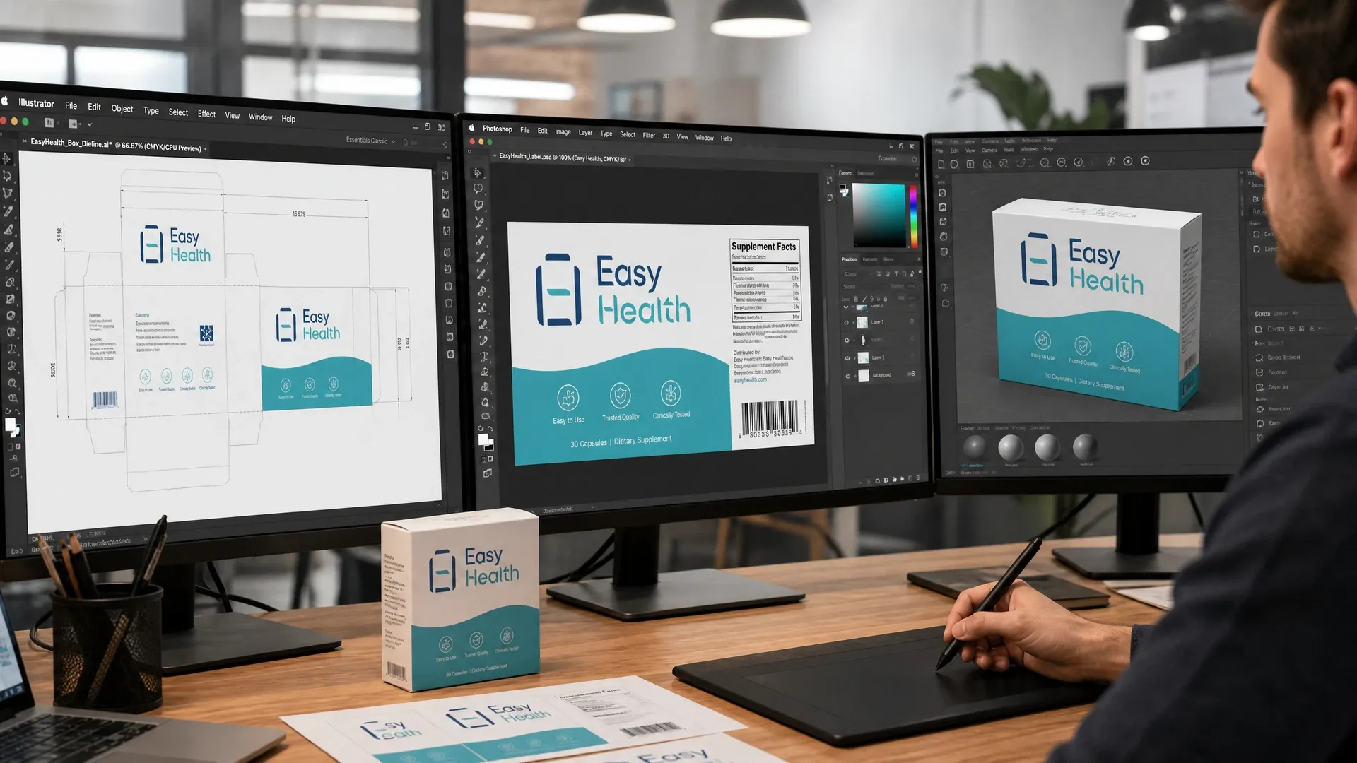
The images illustrate how a full brand identity becomes a coherent product line: from strategy and key elements to colour-led SKU navigation and architecture, then into real layouts and output settings in packaging design software—clarifying the journey from idea to sample.
Design and Labelling Reference Points for Hong Kong and the GBA
Identity must coexist with labelling and legibility. In Hong Kong, common references include Cap.132W and the ‘1+7’ nutrition scheme; Chinese herbal medicines are under Cap.549. For Mainland China, GB 7718 and GB 28050 are common references. Practically, reserve bilingual areas, fixed column widths for nutrition/ingredient tables, avoid medical or therapeutic claims, and leave space and contrast for batch/expiry coding and barcodes. For cross-border sales, confirm current requirements with local bodies or advisors; we can provision layouts and coordinate label updates accordingly.
- Bilingual layout and fixed table widths
- Reserve space for lot/expiry/barcode
- Avoid medical/therapeutic claims
- Pre-provision for cross-border variants
Prepress Preparation and Sampling Coordination
A robust identity must reproduce across print methods and materials. We define colour specifications (Pantone/CMYK/digital mappings), screens and minimum type sizes, safe values for knockouts and fine rules, and flag risky areas (e.g., light text on clear films). Assets are applied to real dielines—wrap labels, blister cards, 3-side-seal pouches, tear-notch sticks, tuck/top-lock cartons—and we test label overlap tolerance and shrink directions where relevant. Prepress deliverables include separations, bleed, spot/varnish masks. We coordinate materials and print suppliers for sampling in Hong Kong, then fine-tune image sharpness and contrast as needed. Each project is assessed and confirmed by a client manager.
- Define colour mapping and min type size
- Apply to real dielines and shrink paths
- Mark spot/varnish/bleed zones
- Sample review in Hong Kong and refine
Service Process Overview
- Discovery and brand audit:Clarify markets, product lines and constraints; gather existing logos, font licences and imagery to define objectives and priorities.
- Category and shelf review:Assess colour and messaging density in category to identify distinct positioning and SKU navigation strategies.
- Architecture and core identity:Define master/sub/endorsed structure, naming rules, colour and type hierarchy, graphics and imagery direction.
- Packaging templates and compliance zones:Build templates for bottles, pouches, sticks, blisters and cartons, with mandatory panels, bilingual layout and table widths.
- Prepress and sampling:Deliver print-ready files with spot/varnish masks; coordinate materials and print sampling; review samples in Hong Kong.
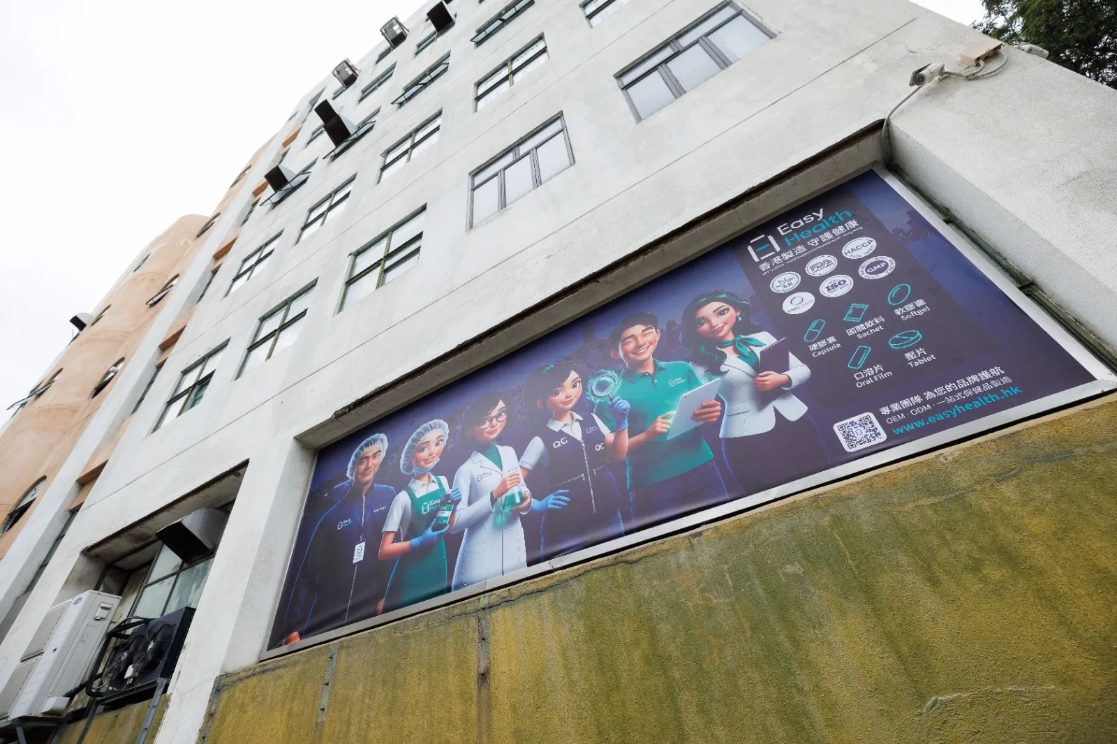
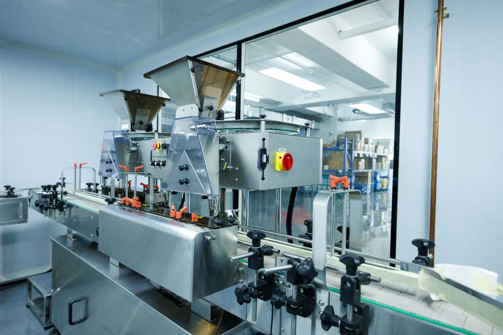
Inside the Easy Health Hong Kong Facility

Brand Architecture and Packaging: Three Common Approaches
| Approach | When to use | Pack visual focus | Ops pros and notes |
|---|---|---|---|
| Masterbrand-led | One brand spans categories | Logo and core colour lead; category colour bands | Simplifies consistency; needs strict colour control |
| Sub-brand tiers | Lines differ greatly or target segments vary | Sub-brand name/graphic lead; master as endorser | High distinction; requires clear navigation |
| Endorsed | Partnerships or credibility signalling | Sub-brand leads; endorser in fixed area | Signals credibility; keep endorser size consistent |
| Private label | Multi-supplier unified look | Standard templates and asset library; clear SKU codes | Fast replication; enforce print specs |
Common approaches from a visual and packaging ops angle. Actual choice varies by project and is confirmed by a client manager.
Before You Start: Design Asset Checklist
- Original logo files and font licence documents (if any)
- List of SKUs, specs and dosage forms (capsule, tablet, powder, liquid, etc.)
- Labelling needs: bilingual copy, ‘1+7’ nutrition, ingredients and cautions
- Intended markets (Hong Kong, Mainland/GBA, etc.) and language versions
- Barcode, lot and expiry coding positions and size preferences
- Sales channels (pharmacy, grocery, e-commerce) to set density and font trade-offs
Supplement Brand Identity Design FAQs
Can We Refresh the Look Without Redesigning the Logo?
Not necessarily. We can refresh colours, typography, graphics and layout rules while keeping your logo. We first test legibility at small sizes and on low-contrast backgrounds across bottles, pouches, sticks, blisters and cartons. If issues arise, we may add clear space, a reversed variant or an outline rather than changing the logo.
Will Bilingual Labels and Nutrition Panels Crowd the Design?
With clear zoning and type hierarchy, no. We reserve fixed column widths and minimum sizes for mandatory panels, while brand and benefits use headline/type blocks to avoid clutter. We also provide high-contrast areas for batch, expiry and barcodes to ensure clean coding.
How Do You Keep Colours Consistent Across Materials and Print Methods?
We supply cross-process mappings (Pantone/CMYK/digital), define substrate priorities and finish effects, and compare samples during prototyping, adjusting ink targets or image contrast as needed. Key colours include tolerances and fallback options.
What Files and Guidelines Will We Receive?
Typically: brand guidelines (colour, type, graphics, imagery, layout rules), print-ready label and carton files, separations with varnish/spot masks, cut lines and bleed settings, plus templates for each packaging format. Output presets and examples are provided where relevant.
What Should We Note When Designing for Hong Kong and Mainland China?
Define a master and derivative approach: keep brand and core identity fixed; adapt mandatory panels for regulatory differences (table fields, wording, units). Reserve swappable compliance areas and alternate type scales to minimise reflow. Confirm specifics with local bodies or advisors; we provision space and coordinate label updates.
Related Packaging Services
Discuss Your Brand Identity and Packaging Project
Share your design assets, SKU list and target markets. Easy Health will coordinate labels, cartons and multi-format deployment and sampling in Hong Kong. Timelines and details vary by project and are confirmed by a client manager.
Last updated: