Sachet packaging design for sachets and stick packs
Based in Hong Kong with our own facility, Easy Health provides OEM/ODM, layout and label design for sachets and stick packs, carton coordination, prototyping and packaging production. Work is organised to GMP‑aligned procedures, with food safety management referenced to FSSC 22000; certificate scope and supporting documents for relevant facilities can be reviewed on request. Each project is individually assessed and confirmed by an account manager. Contact us via WhatsApp.
Summary:This page focuses on sachet and stick pack layout and design: front/back hierarchy, tear and usage cues, batch/date coding zones, multi-stick carton layout, and aluminium foil print with matte/gloss finishes—practical guidelines you can apply.
What sachet layout decisions should you make first?
- Which info sits on front vs back for clarity. - How to design tear-notch, pour direction and icons. - Bilingual layout, barcode and QR in tight space. - Reserving zones for batch and “best before”/“use by”. - Visual alignment for multi-stick cartons and display. - Choosing matte, gloss or spot effects on aluminium foil.
Essentials of sachet packaging design layouts
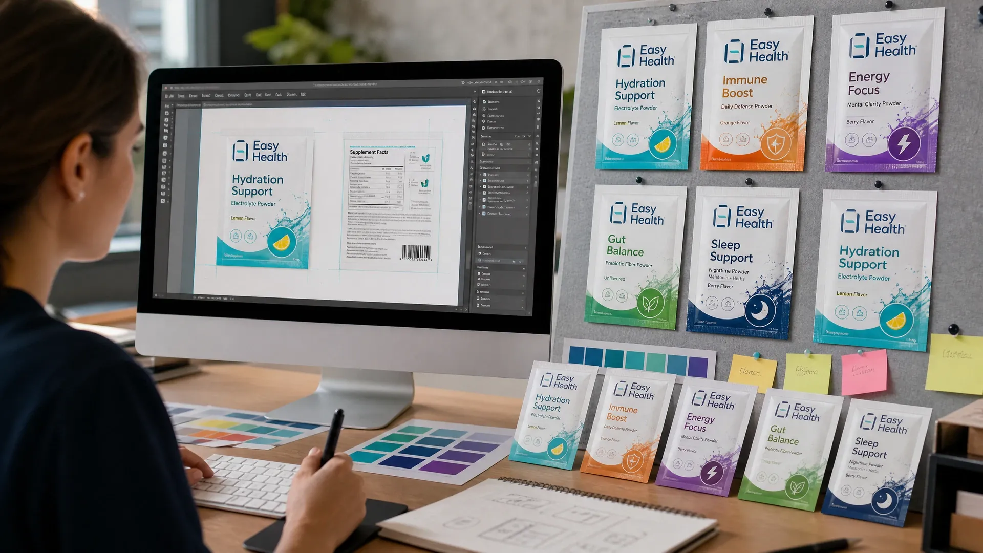
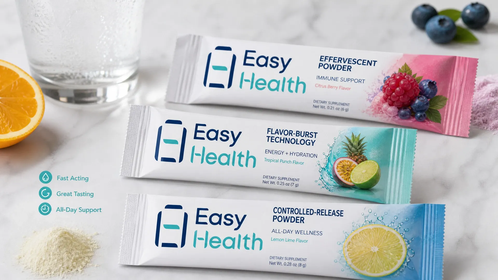
With limited real estate, define a clear hierarchy. Place product name, dosage form and one key point on the front; regulatory items (e.g., ingredients, net quantity, nutrition) usually go to the back, keeping clear of seals and folds with bleed and safe margins. Sticks read best vertically; choose point sizes for shelf distance. Flat sachets allow a front-subfront split. Avoid cramped bilingual lines—use block sections or headers in EN with CN/EN body as needed. Keep barcodes/QR with adequate quiet zones away from heat seals; use tabular nutrition for scan-friendly reading. We coordinate dielines, type sizing and alignment checks, and align printers and material suppliers during prototyping.
- Front: name and key identifier
- Back: regulatory and details
- Sticks favour vertical reading
- Segmented bilingual layout
Tear guidance and use cues
Align tear-notches with clear arrows and an ‘OPEN’ icon; add a “POUR HERE” mark at the spout end to reduce spillage. For sticks, place notch guide marks so the cut does not clip artwork. If two-step opening is used, number the steps along the side. For liquids or viscous products, add squeeze gestures. Keep legible type near notches, as seal texture and tear fibres can affect readability; use high-contrast colours. During prototyping, review whether torn edges obscure content and fine-tune dielines and layout if required.
- Arrows/icons beside notch
- Clear “pour here” direction
- Guide marks avoid clipping
- High-contrast for clarity
Visual guide to sachet details and foil legibility
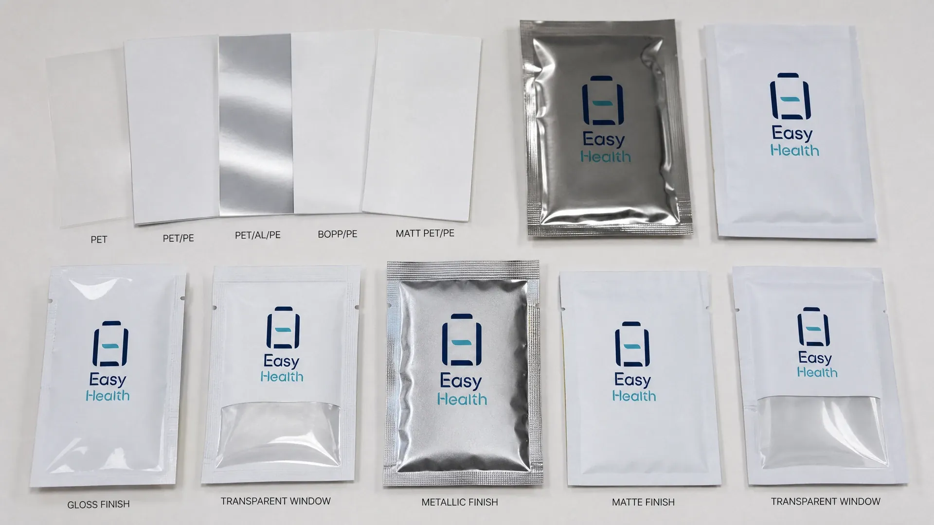
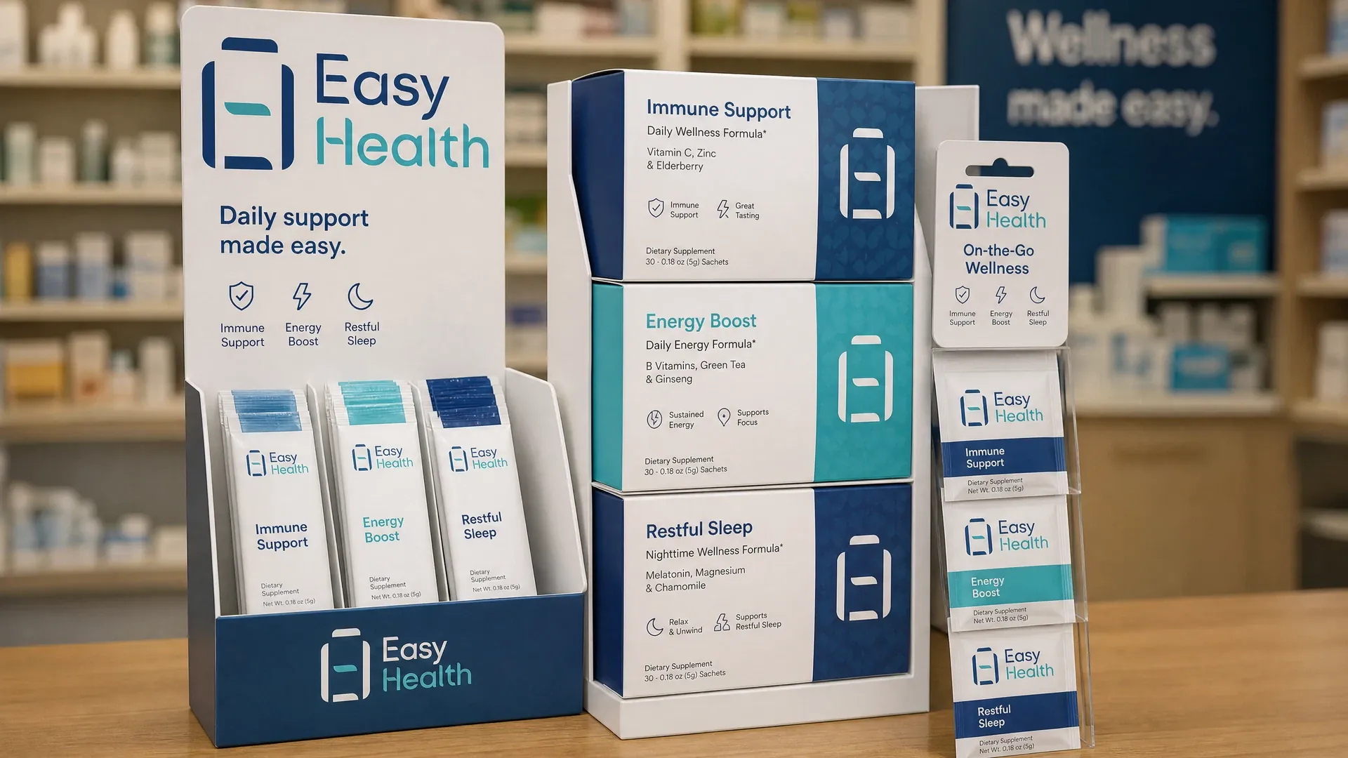
Use the images to compare front/back hierarchies, clarity of tear icons, placement of batch/date zones, and alignment within multi-stick cartons. They also show legibility and glare differences between matte, gloss and spot effects on aluminium foil.
Reserving batch and date coding zones
Keep coding areas away from embossing, heat seals and dense dark backgrounds. For Hong Kong prepackaged foods, use clear wording for “best before” or “use by”. For Mainland sales, prepare layout with general expectations of GB 7718/GB 28050. We coordinate coding methods on line (e.g., CIJ or thermal transfer) and reserve suitable space and contrast blocks per equipment. Place CN/EN together for inspections; for multi-market packs, group languages and indicate applicability. Final arrangements are confirmed by the account manager.
- Avoid seals/embossed zones
- CN/EN date wording aligned
- Light contrast window for code
- Method aligned to equipment
Stick pack packaging design for cartons and retail display
Stick packs are often sold in multi-pack cartons. Define a primary display direction and align stick fronts and tear ends to avoid mixed orientations. Add carton cues (e.g., batch window, flavour colour blocks) for quick stock checks. Mirror visuals between sticks and carton fronts for an integrated unboxed look. For tear-open display cartons, route tear lines around key text, ensuring readability post-tear. Mark inlays with orientation and stack reminders to reduce edge creasing. Easy Health coordinates carton dielines, inlays and stick artwork alignment, checking real-world placement during prototyping.
- Unify display orientation
- Carton batch/check window
- Linked carton–stick visuals
- Tear lines avoid key text
Layout and sampling workflow for sachet packs
- Brief and product info:Define contents, markets, languages and labelling points to set hierarchy.
- Dieline and key zones:Create dieline, seals and notch zones with safe margins and code areas.
- Layout and proofing:Compose front/back, bilingual text, codes and nutrition table; first proof.
- Prototyping and visual check:Coordinate samples; review legibility, notch function and glare behaviour.
- Print and material coordination:Align printers and materials; arrange press registration and production checks.
Inside the Easy Health Hong Kong Facility



Information placement across small formats
| Aspect | Flat sachet | Stick pack | Foil appearance |
|---|---|---|---|
| Front focus | Name + one key point | Name set vertically | Limit glare over text |
| Back content | Ingredients + nutrition | Indented lists work | Avoid fine type on dark |
| Edge zones | Barcode away from seals | Avoid notches/folds | Keep light coding window |
| Open cues | Top tear + arrow | End tear + pour mark | High-contrast icons |
Design orientations for reference; actual layouts confirmed per project.
Pre-artwork checklist for sachet packs
- Product name and dosage form clear; front hierarchy defined
- Notch and pour cues are high-contrast and clear of seal areas
- Batch/date zone has space with CN/EN wording nearby
- Barcode/QR have quiet zones; away from edges and folds
- Nutrition and ingredients typeset for readability; bilingual not cramped
- Chosen foil finish; matte/gloss legibility verified in sample light
Sachet packaging design FAQs
What usually goes on the front and back of sachets or sticks?
Commonly, front holds product name, dosage form and one key point; back aggregates ingredients, net quantity, nutrition table and manufacturer/importer details. For Hong Kong prepackaged foods, plan nutrition under the ‘1+7’ scheme; for Mainland, consider GB 7718/GB 28050 general expectations. As scope varies by category and market, review applicability with our account manager at layout stage.
How can bilingual text and a barcode fit on stick packs?
Use zoned layout: front for name and key identifiers; back for regulatory items in tables or indented lists. Keep barcode/QR with quiet zones near a straight edge for scanning. Move secondary details to the outer carton or leaflet with symbols if needed. Verify minimum point sizes during sampling; final setup confirmed by our account manager.
Which batch and date coding methods affect layout?
Typical methods are CIJ or thermal transfer. Reserve a light-colour window matching character height, away from seals/embossing; place CN/EN date wording together, using ‘best before’ or ‘use by’ clearly. Method and position are confirmed to suit the production line.
How do matte and gloss finishes affect aluminium foil sachet packaging?
Both are feasible. Gloss gives punch but can glare, reducing fine-type readability; matte tames glare and suits dense text. Spot effects can highlight key areas. Sample on similar materials and review under shelf, daylight and warm indoor lighting before deciding.
What sampling options support sachet layout review?
We can arrange digital proofs or material-based samples to review colour, glare, notch placement and legibility. Timing varies by project and is confirmed by the account manager. Approve key samples before final artwork to avoid late-stage rework.
Related Packaging Services
Discuss your sachet or stick pack layout and samples
Planning front/back hierarchy, tear/date zones, or matte/gloss on aluminium foil? Message Easy Health on WhatsApp to speak with an account manager. Each project is individually assessed and confirmed.
Last updated: